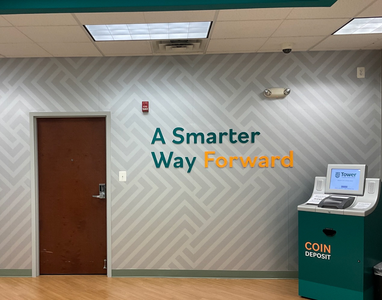
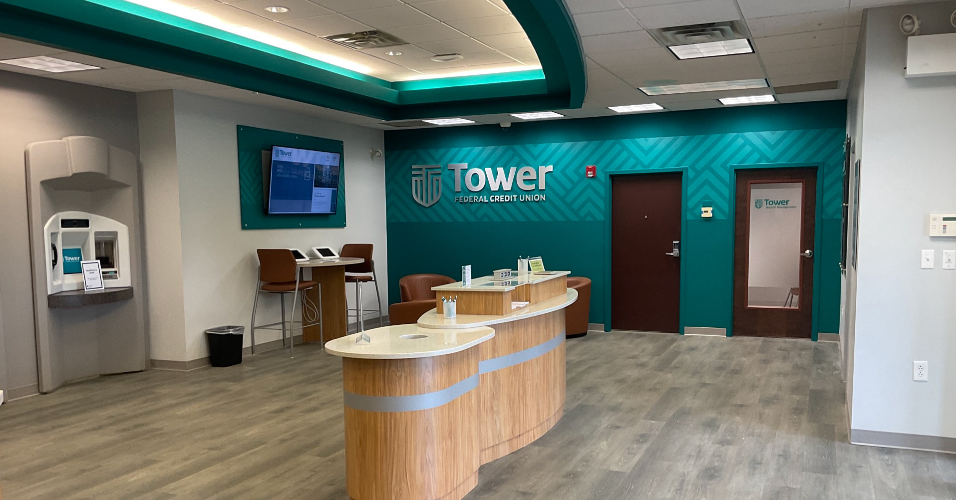
Logo Before & After
The Smart Shield
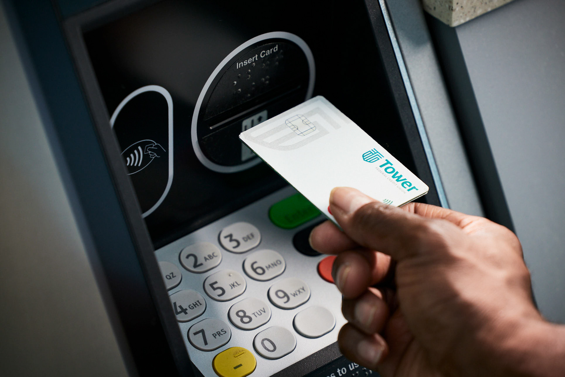
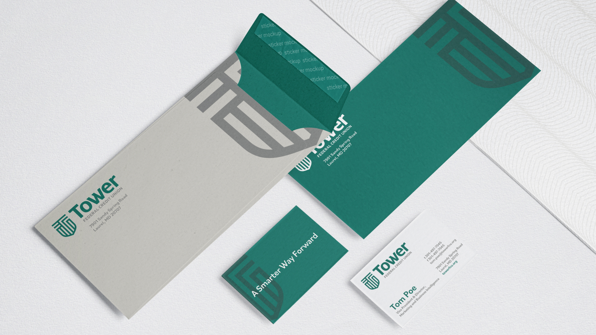
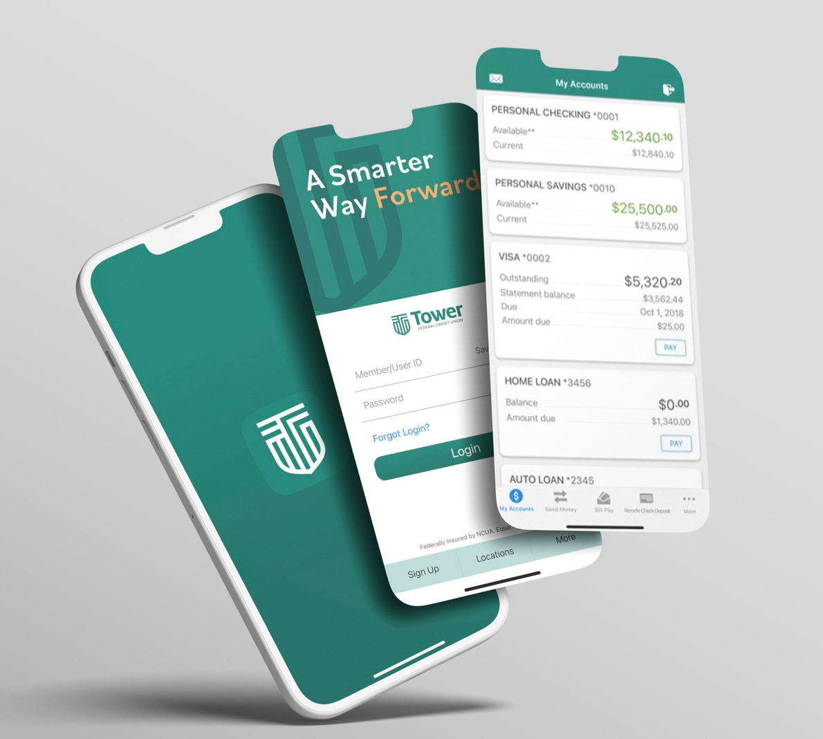
The Tower logo is a Smart Shield representing innovation, security, and personalization. It references a fingerprint, a microchip, and the Tower T.
Running Up That Hill
We launched the rebrand with a custom video and photo shoot in Annapolis, Maryland. The video led Tower’s market launch, while the photography carried through every print touchpoint. And yes—I even made my big-screen debut as Jogger #3.
Custom Photography
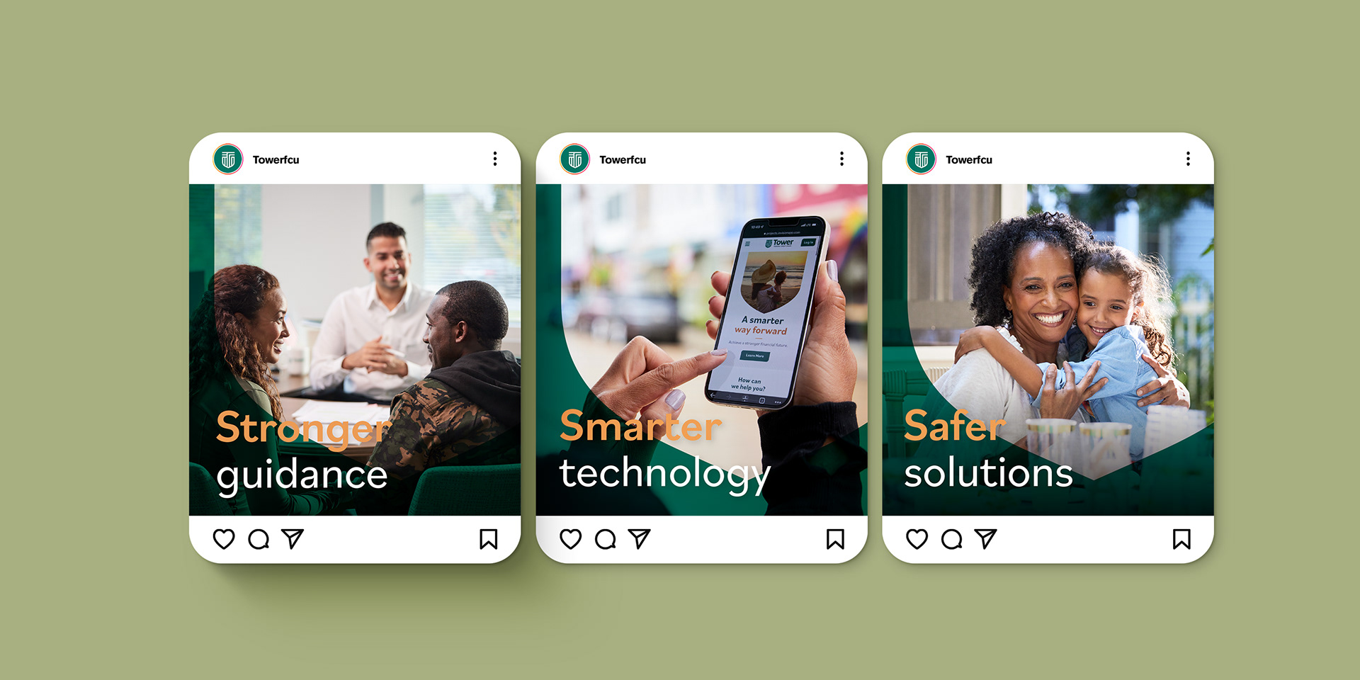
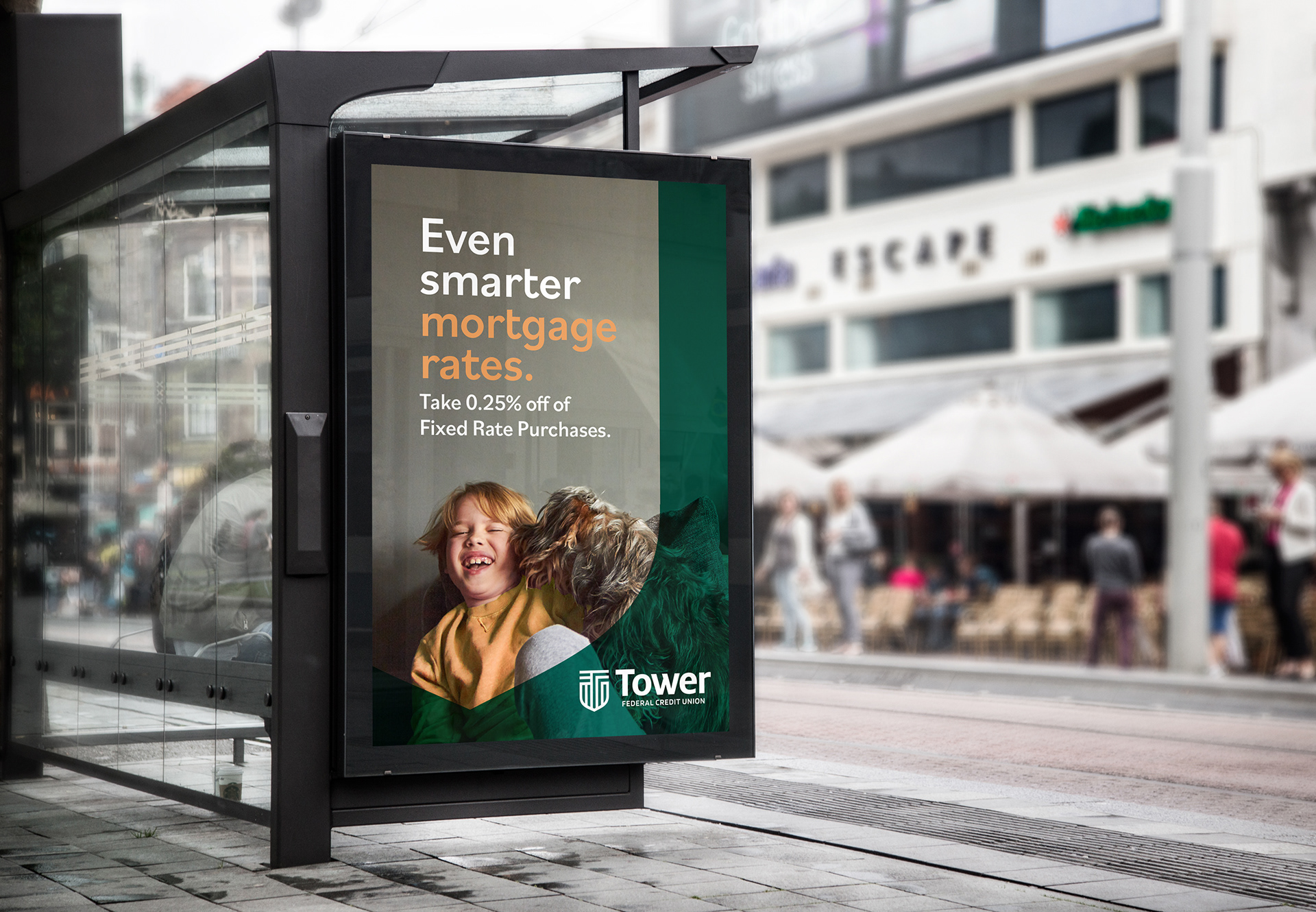
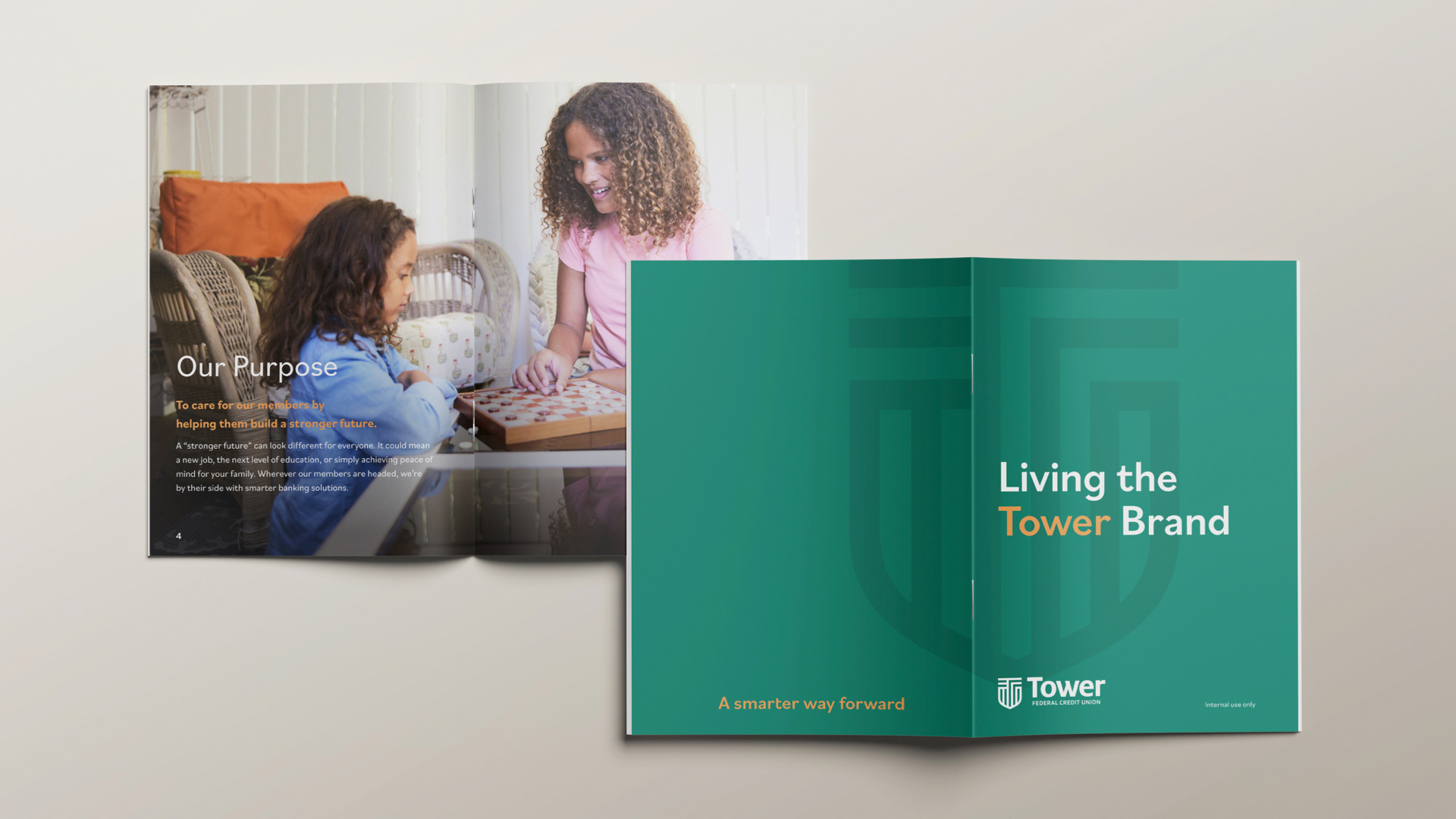
Custom photography captured the heart of the launch campaign. Alongside professional talent, Tower employees volunteered to be part of the shoot—giving them a chance to show their pride in the credit union they help power every day.



Award-Winning Results
Through collaboration, flexibility, and a few unexpected challenges, the rebrand helped drive a 20% year-over-year increase in new members and new accounts—and earned a 2024 CUNA Diamond Award along the way.
