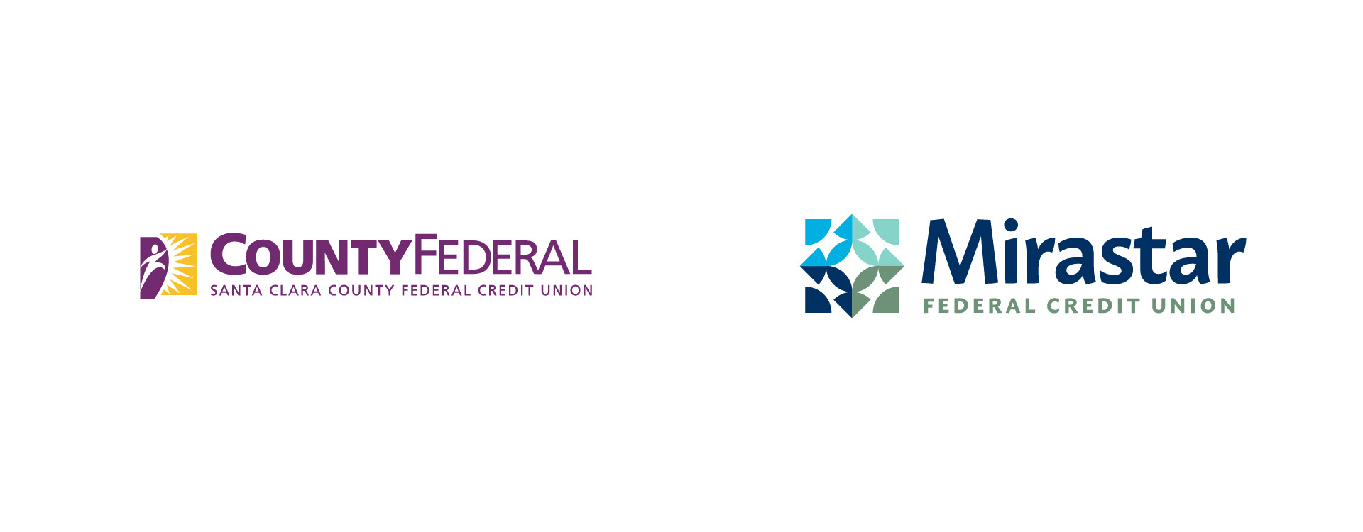
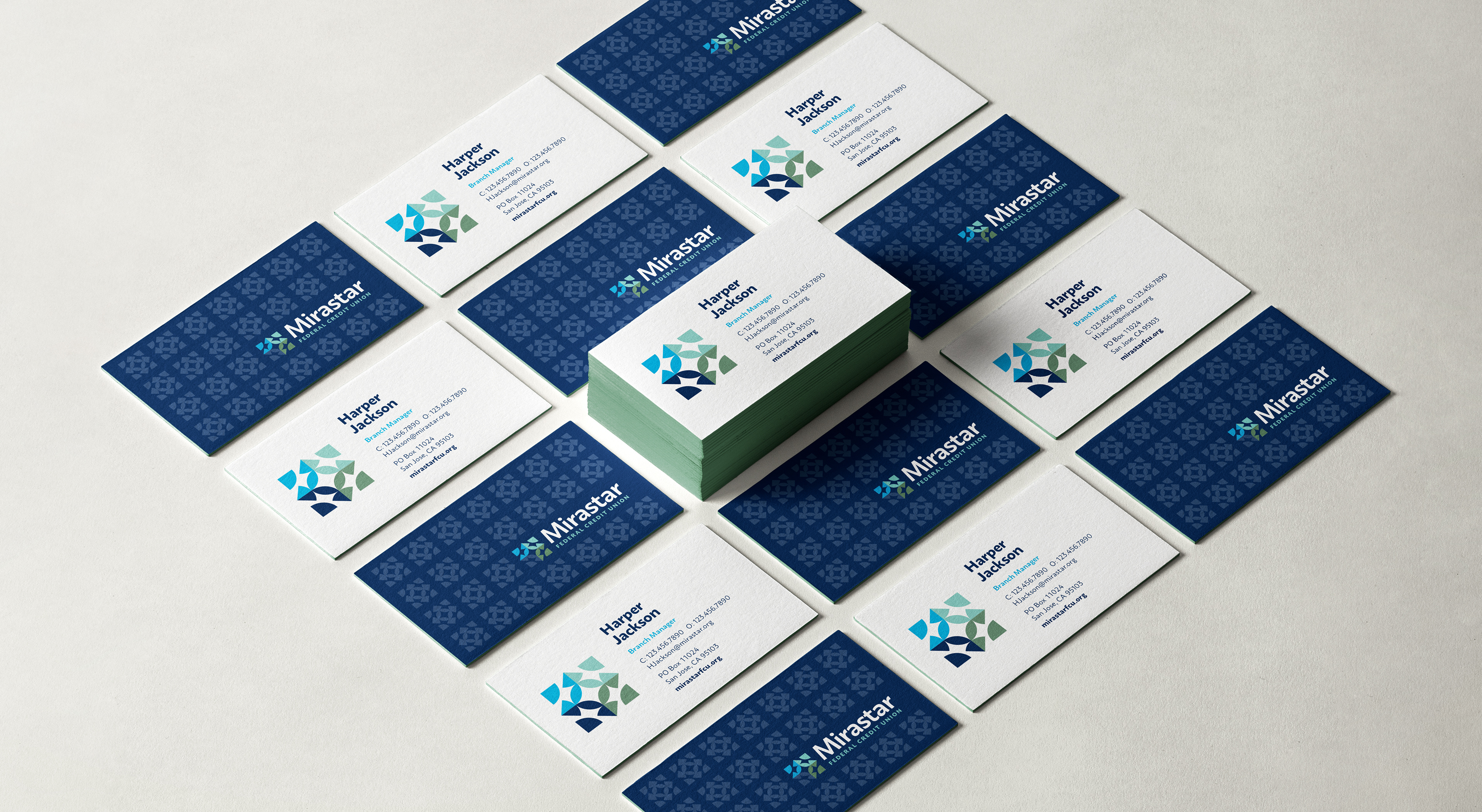
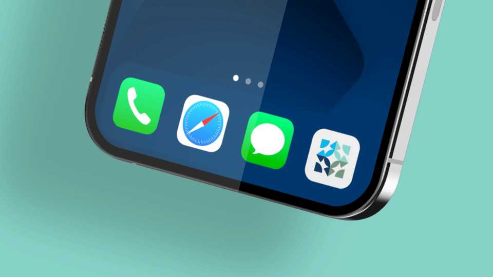
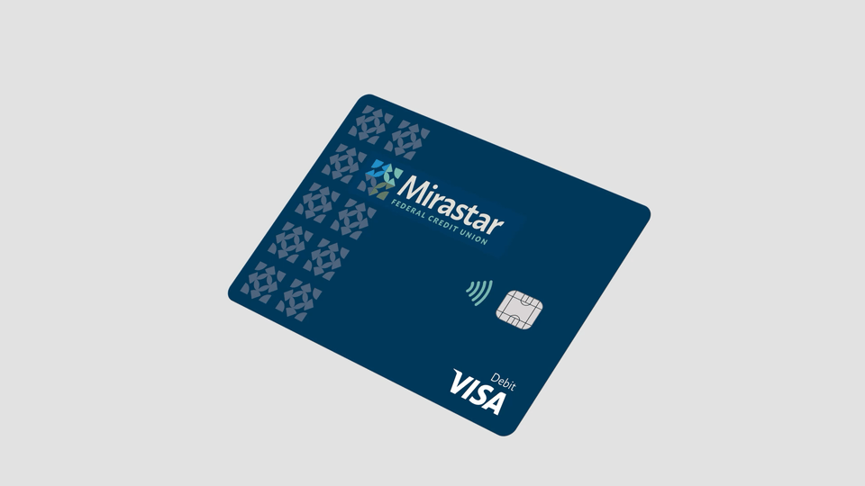
Logo Before & After
The Mirastar
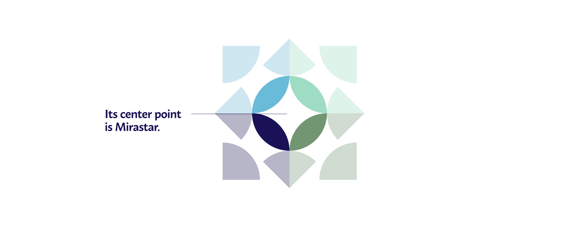
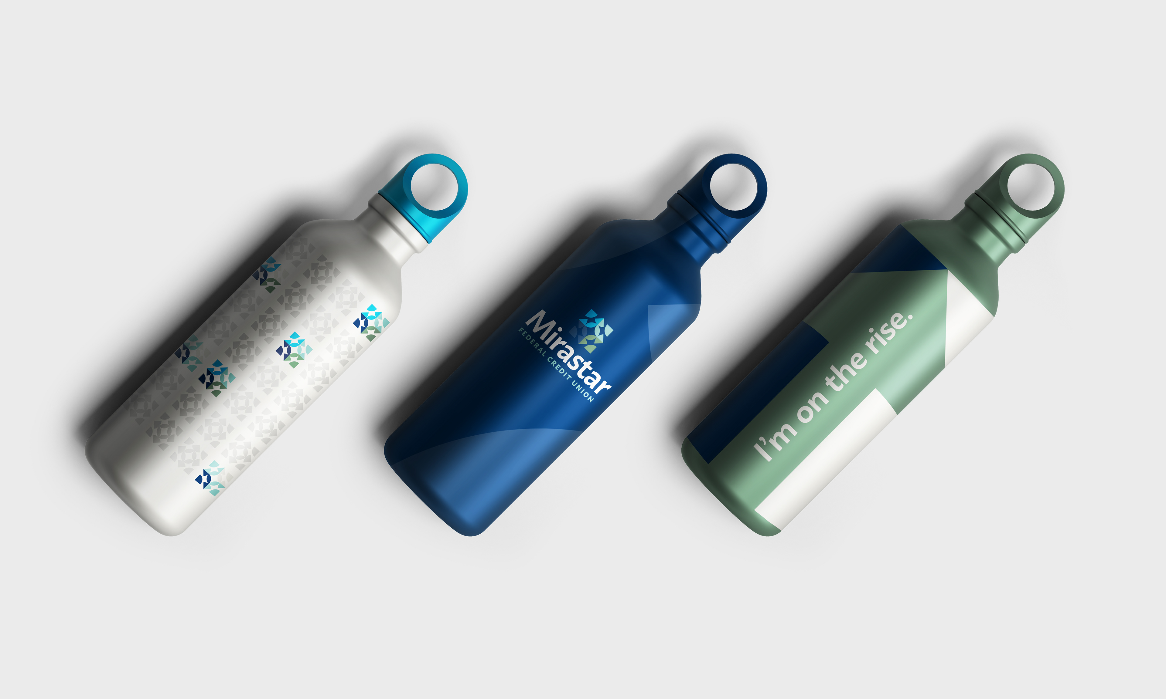
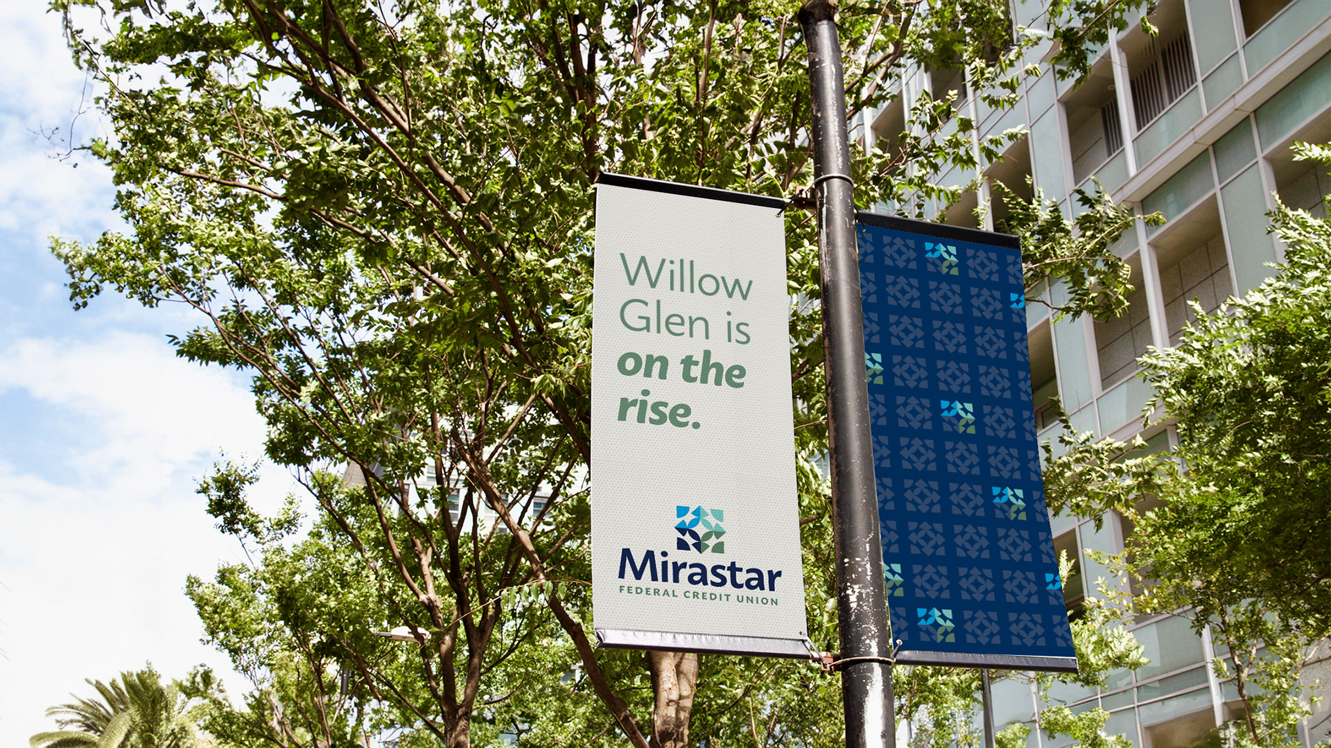
The Mirastar logo is a symbol of connection. Interlocking forms represent family, belonging, and the belief that no one is an island—each individual stronger as part of a shared community.

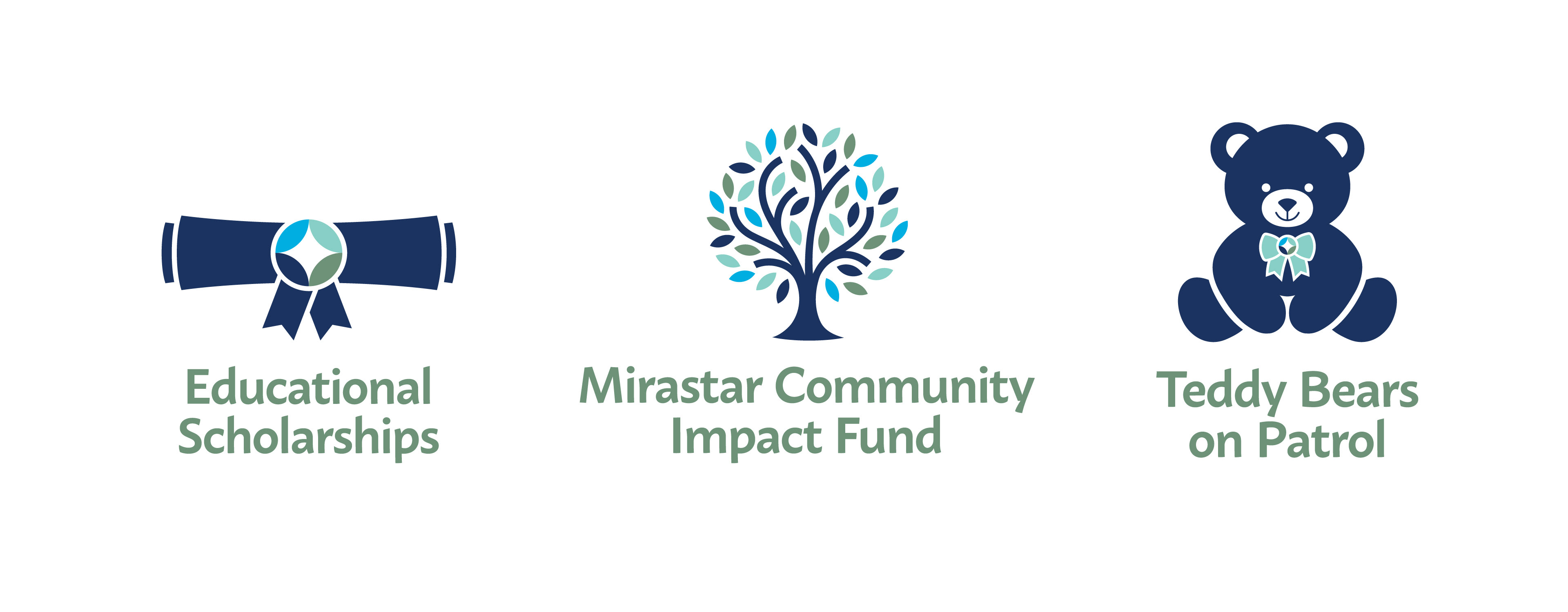
Subrand Logos
An Editorial Approach to Community
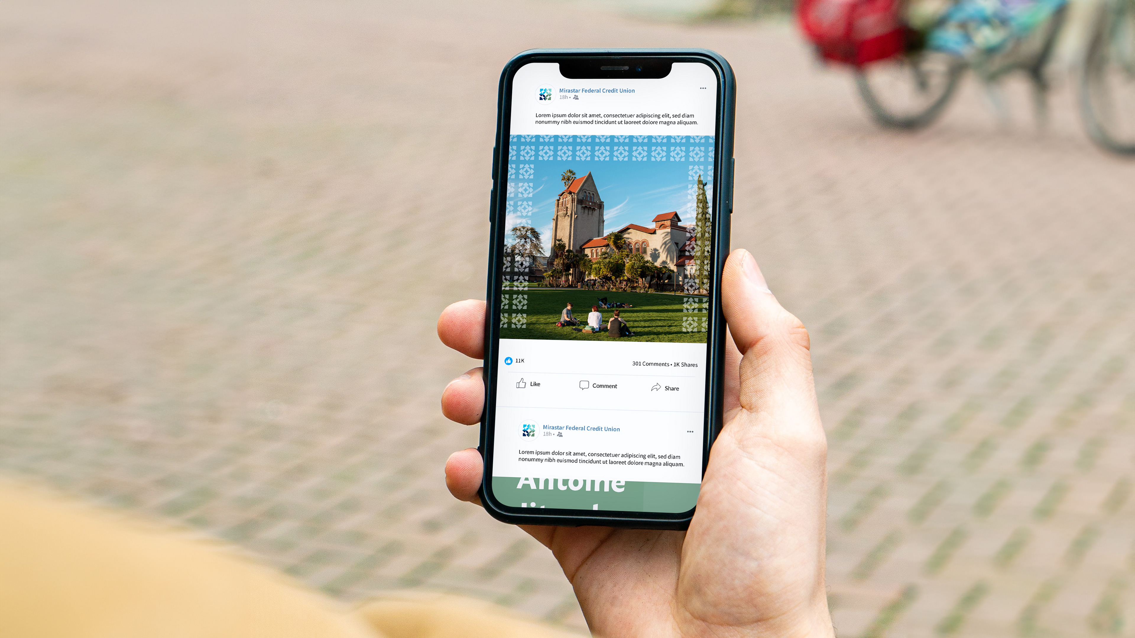
In building the photography library, we were intentional in selecting stock photography with an editorial, real-life feel—capturing authentic moments that reflect the people and communities the brand serves. With a clean, simple visual identity, photography plays a central role in visual communication, adding warmth and humanity across brand touchpoints.


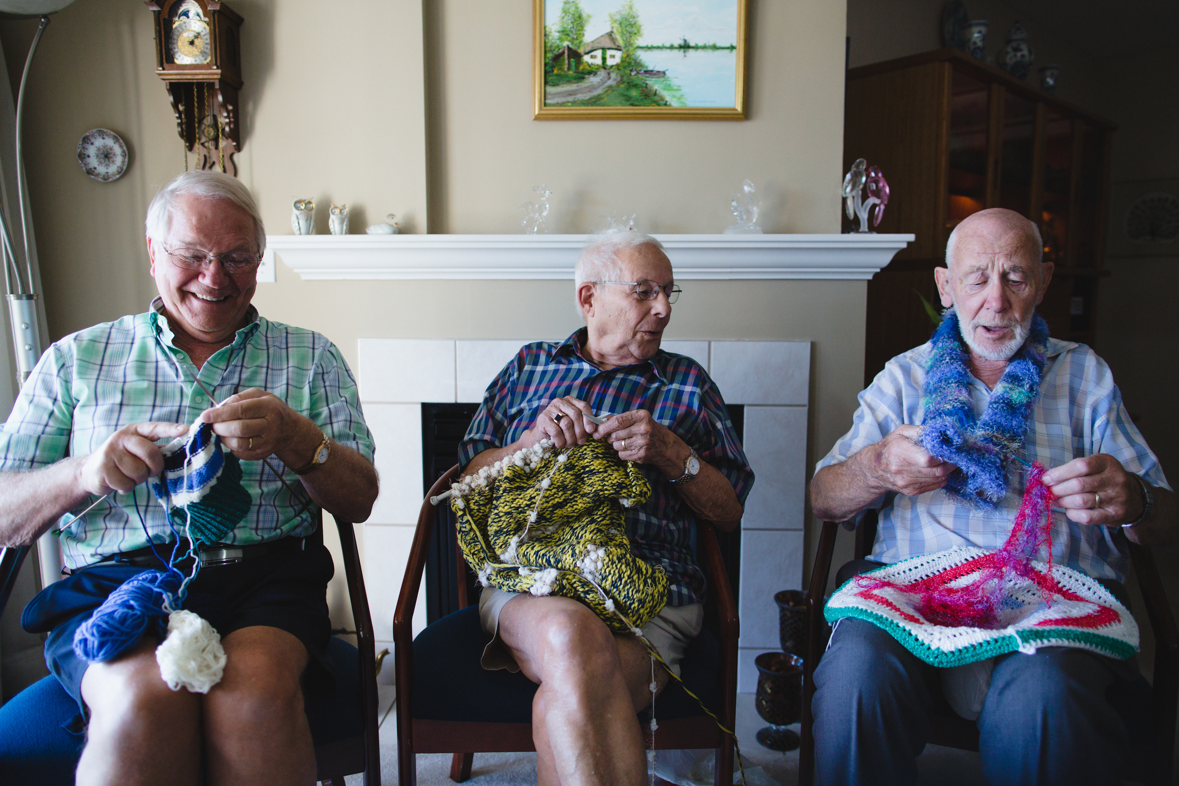


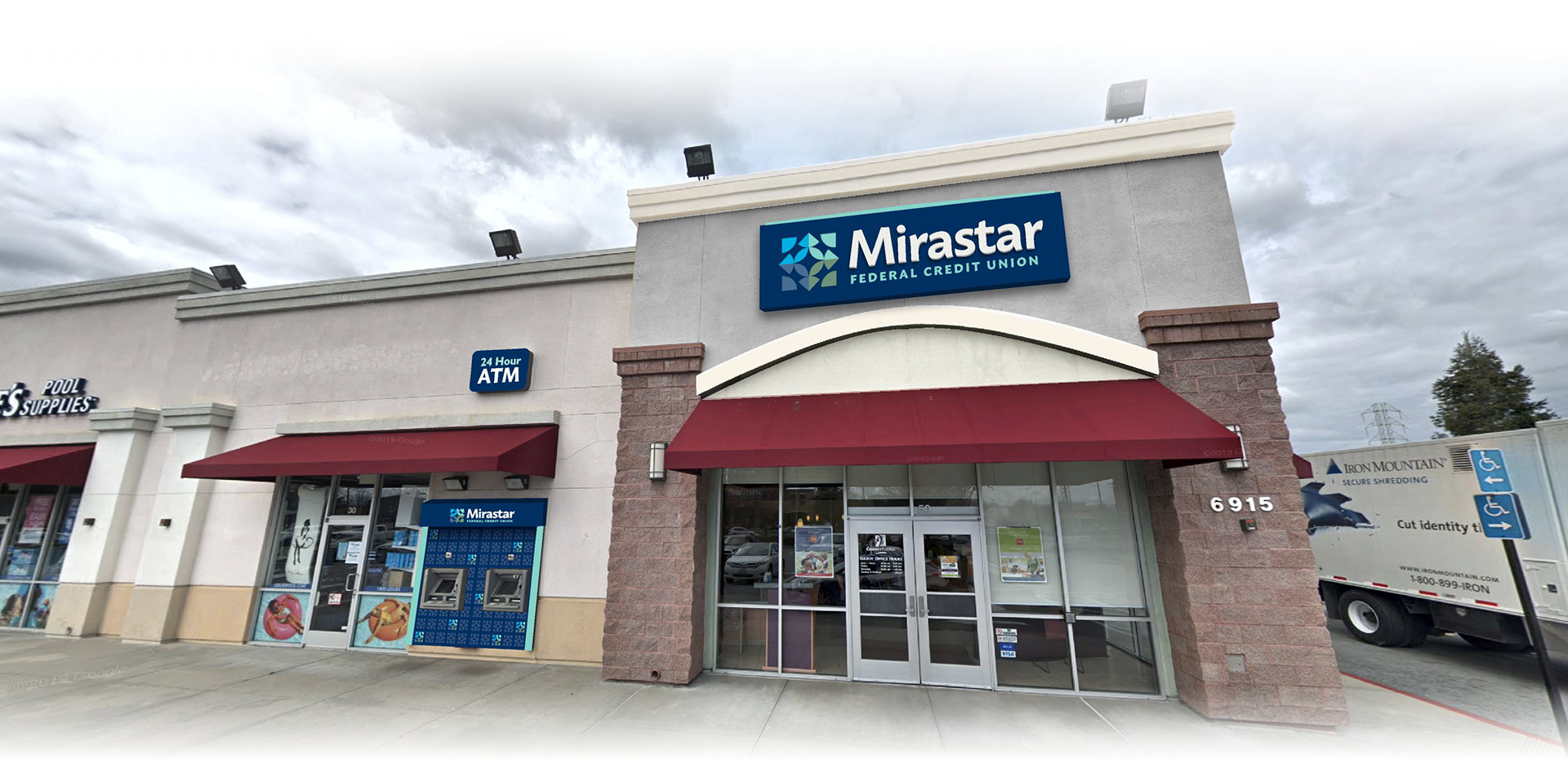
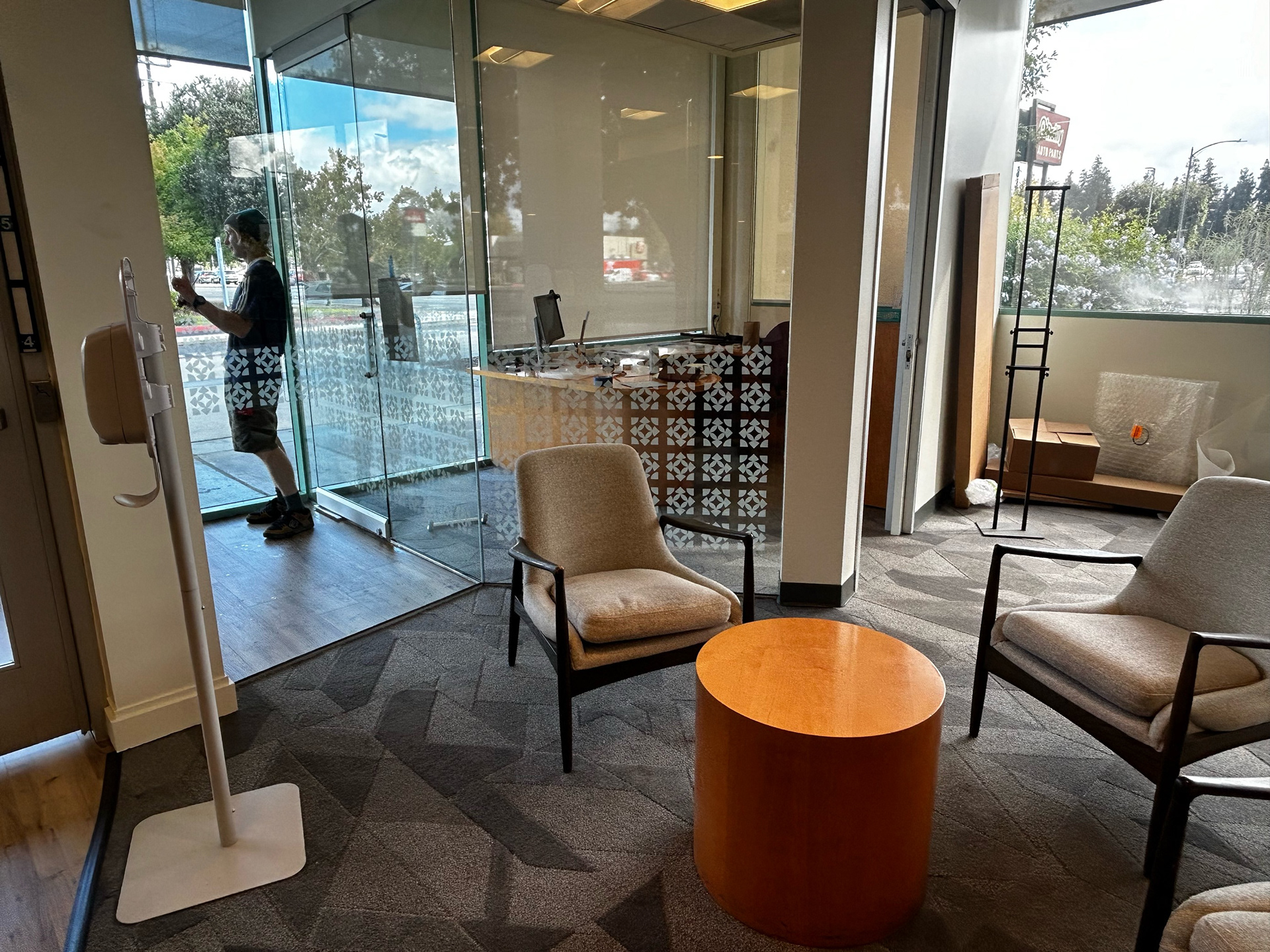
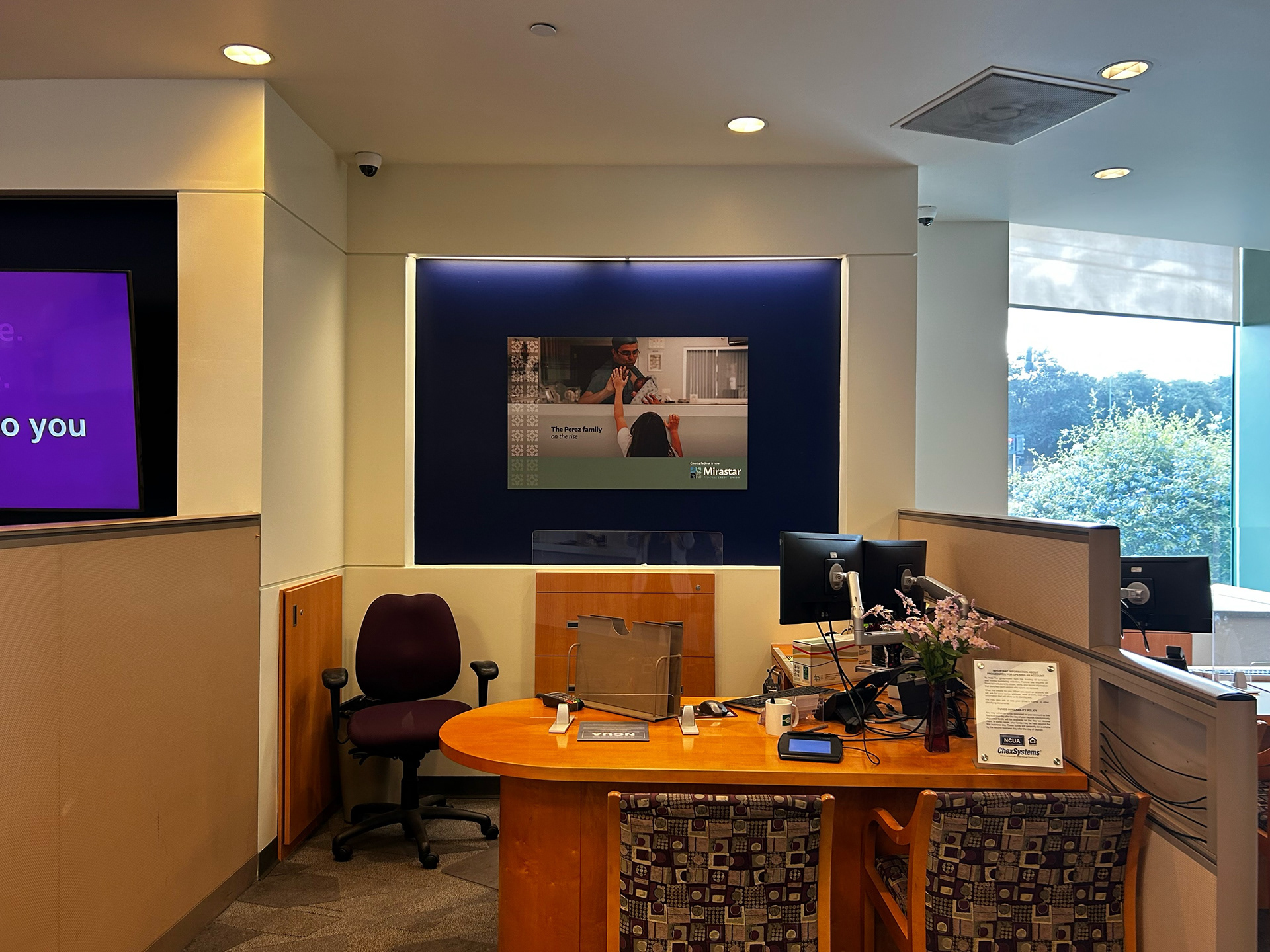
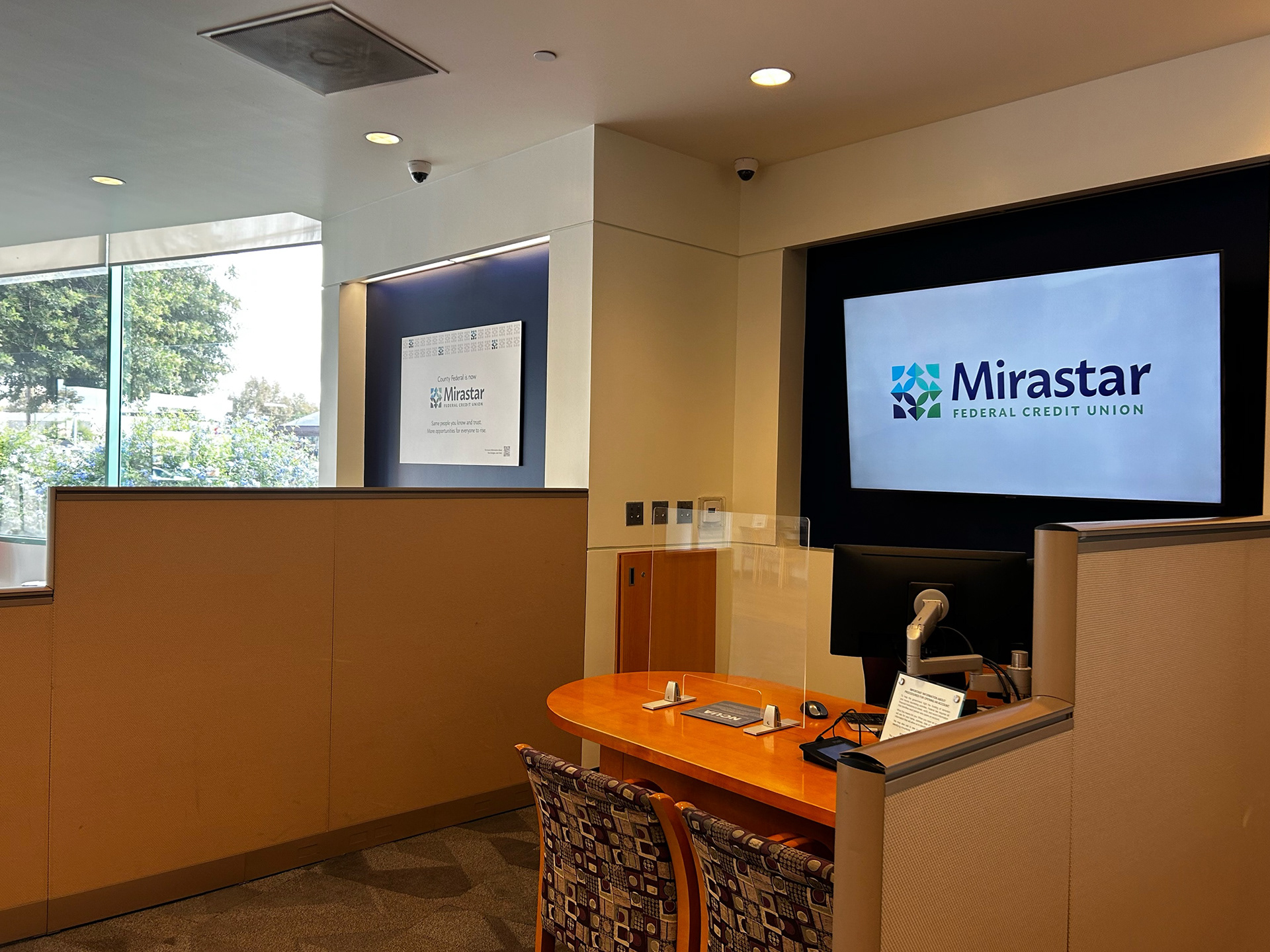
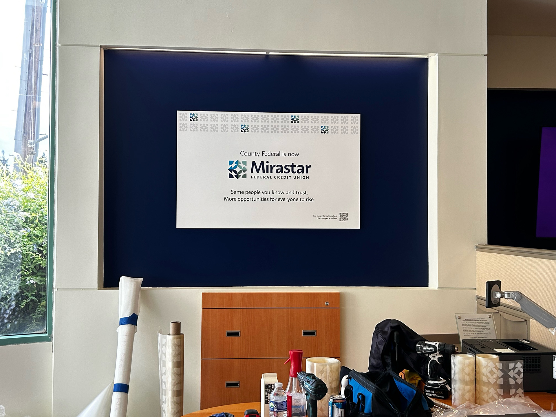
Branch Photography