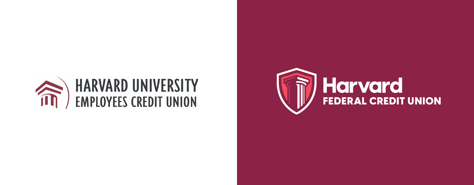
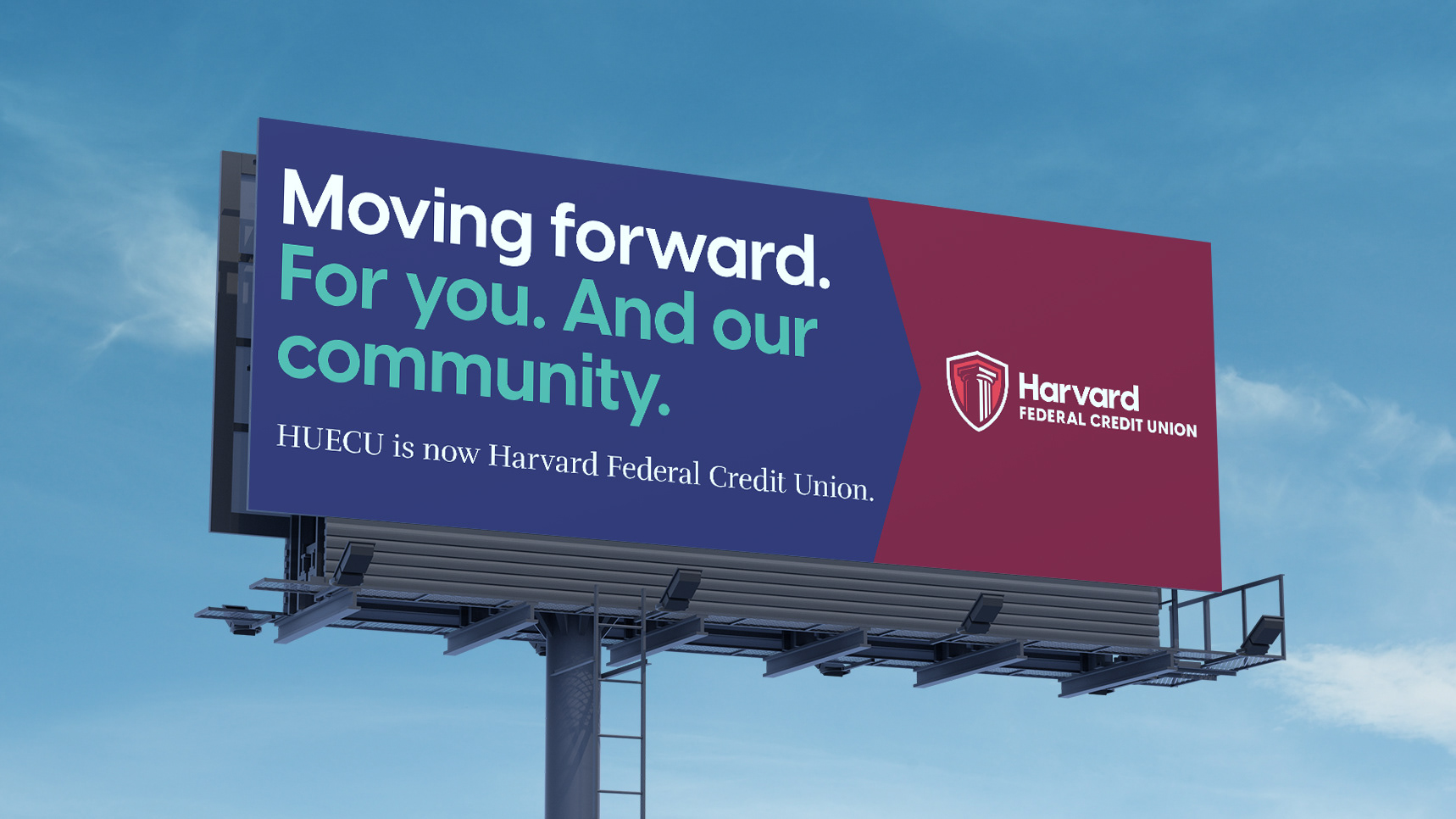
Logo Before & After

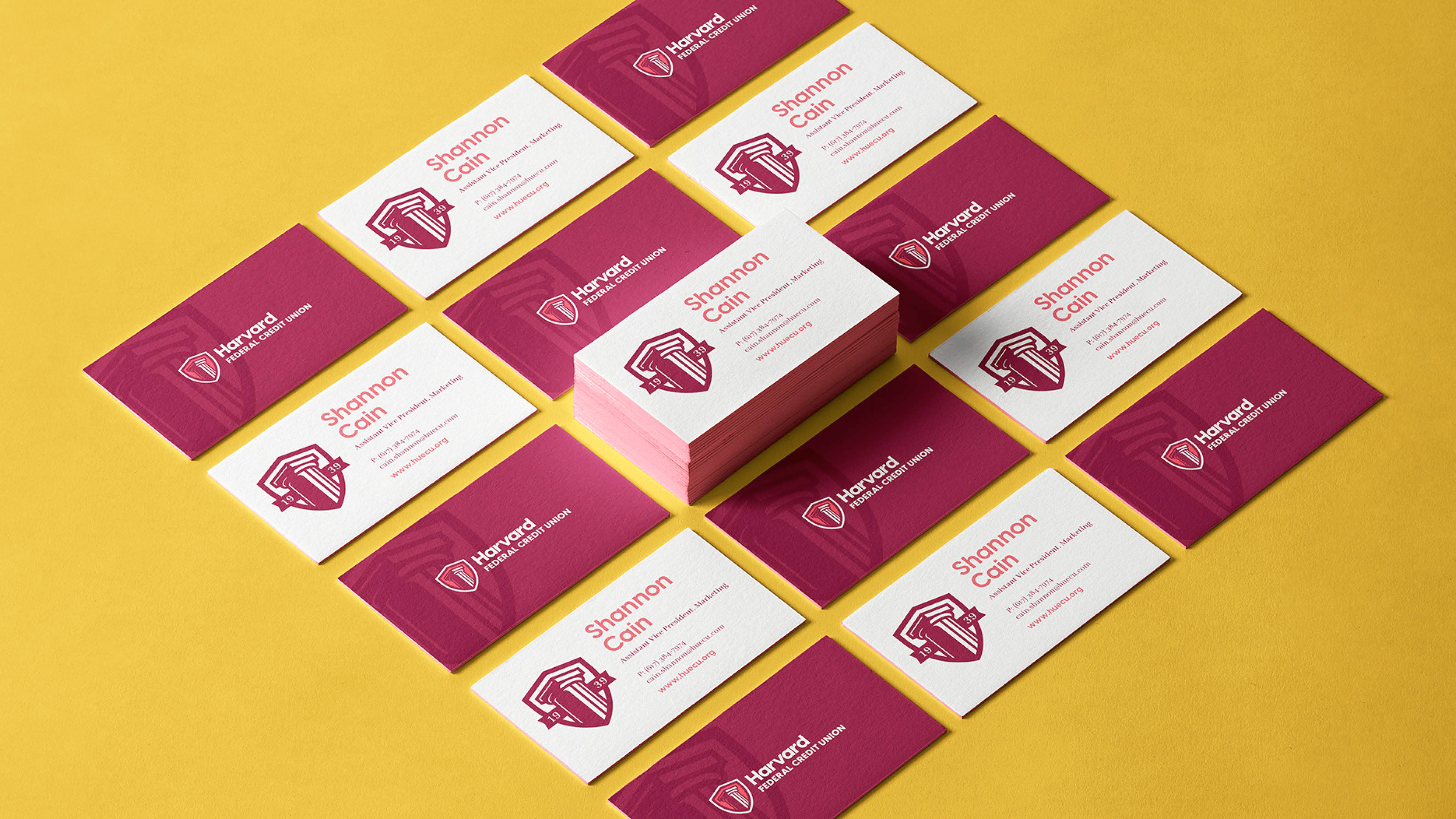
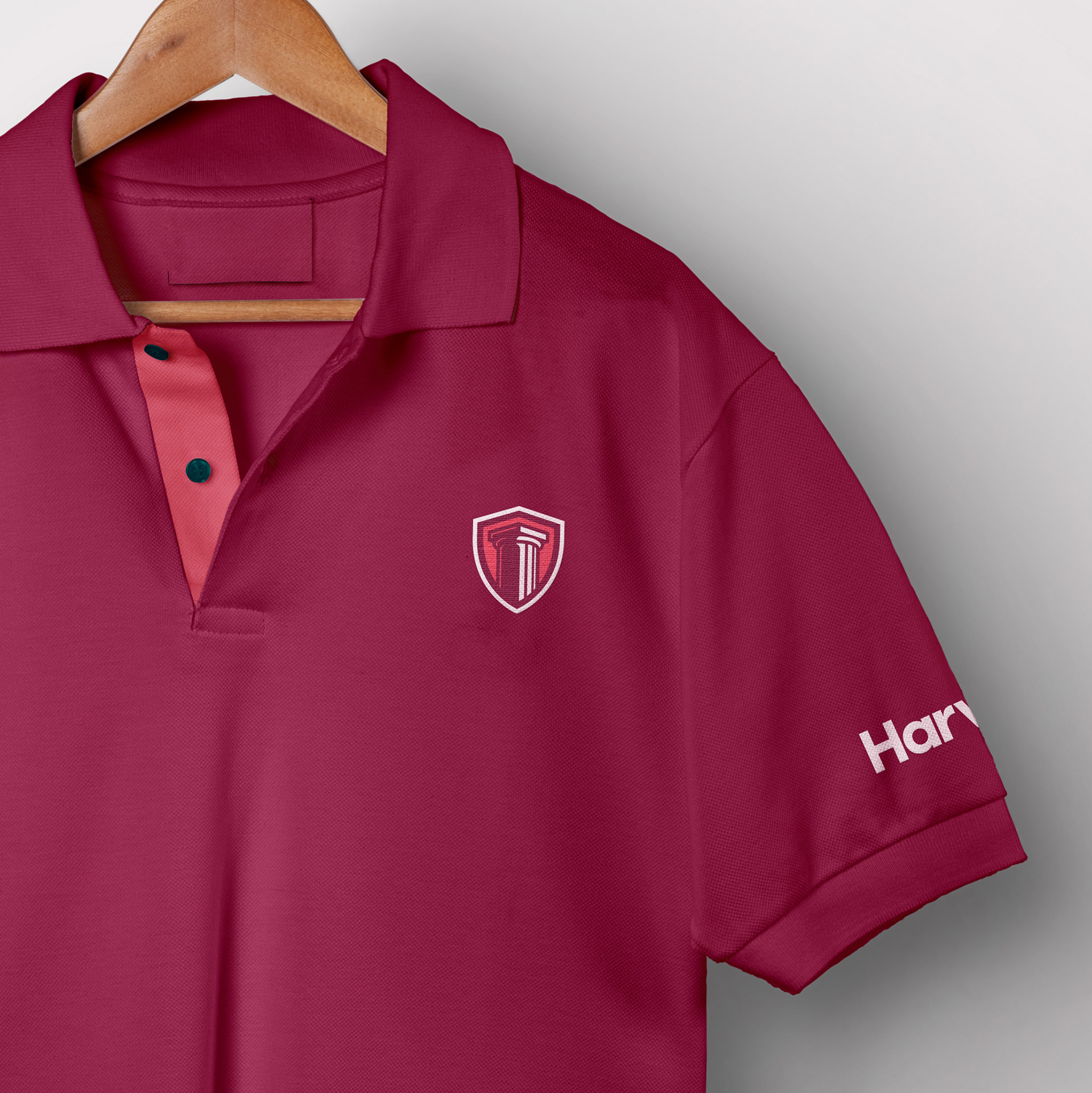
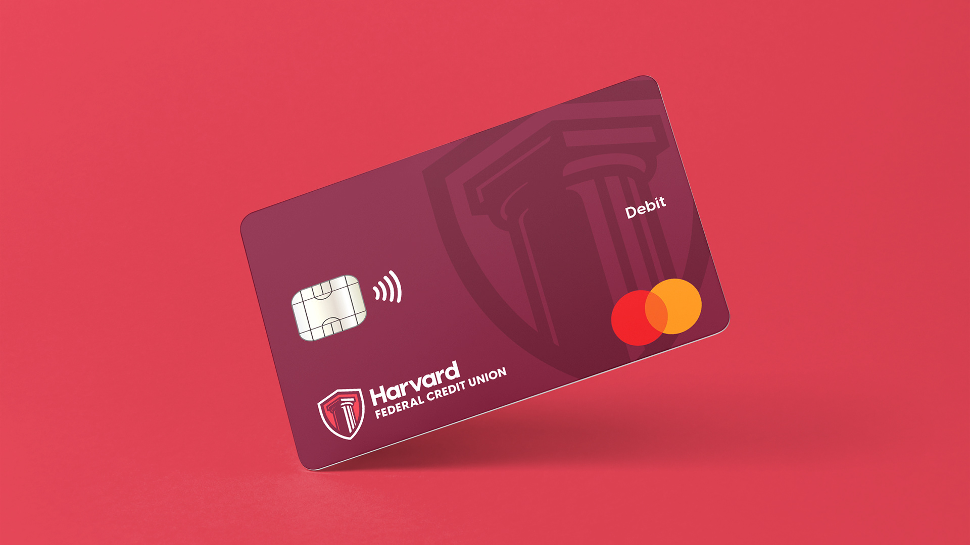
The Harvard Shield
The logo draws from the traditional Harvard University shield, combined with a simplified column to symbolize strength, stability, and longevity. Designed for clarity and balance, the mark reflects Harvard FCU’s values of integrity and trust while introducing a more modern, forward-looking expression.
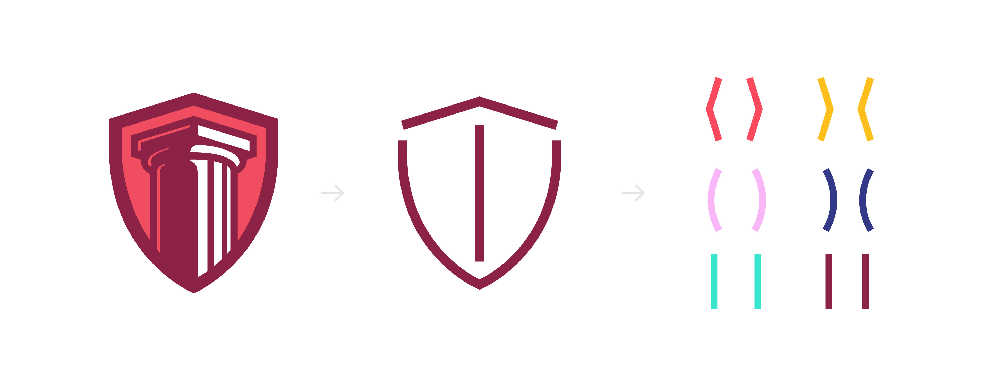
Visual Identity
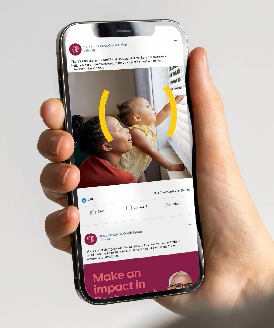
Pulled from the geometry of the logomark, these brackets power the whole visual system.
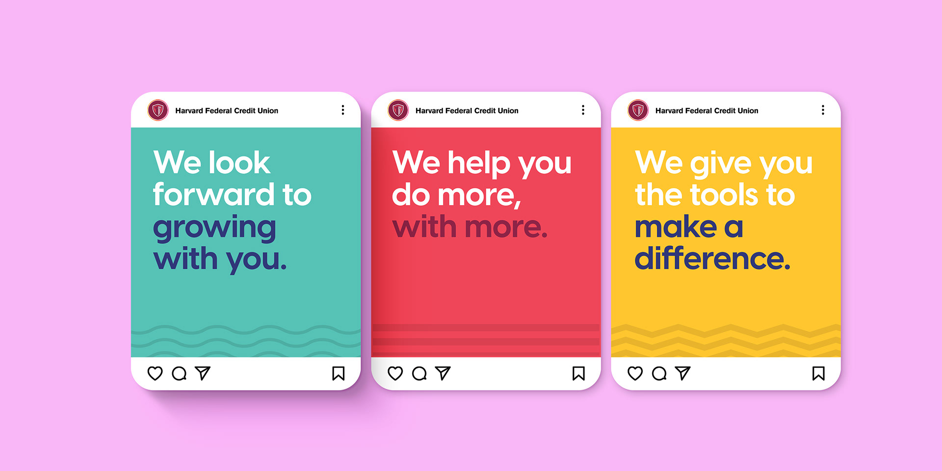
Paired with the bright colors and bold type, they flex across everything—from repeating patterns to playful emoticons.
Paired with the bright colors and bold type, they flex across everything—from repeating patterns to playful emoticons.


Brand Photography
The photo library centers on portraits that put people front and center, highlighting their individuality and interests. A natural, diverse, and optimistic style helps humanize the brand and pairs seamlessly with the bold, graphic elements of the identity.


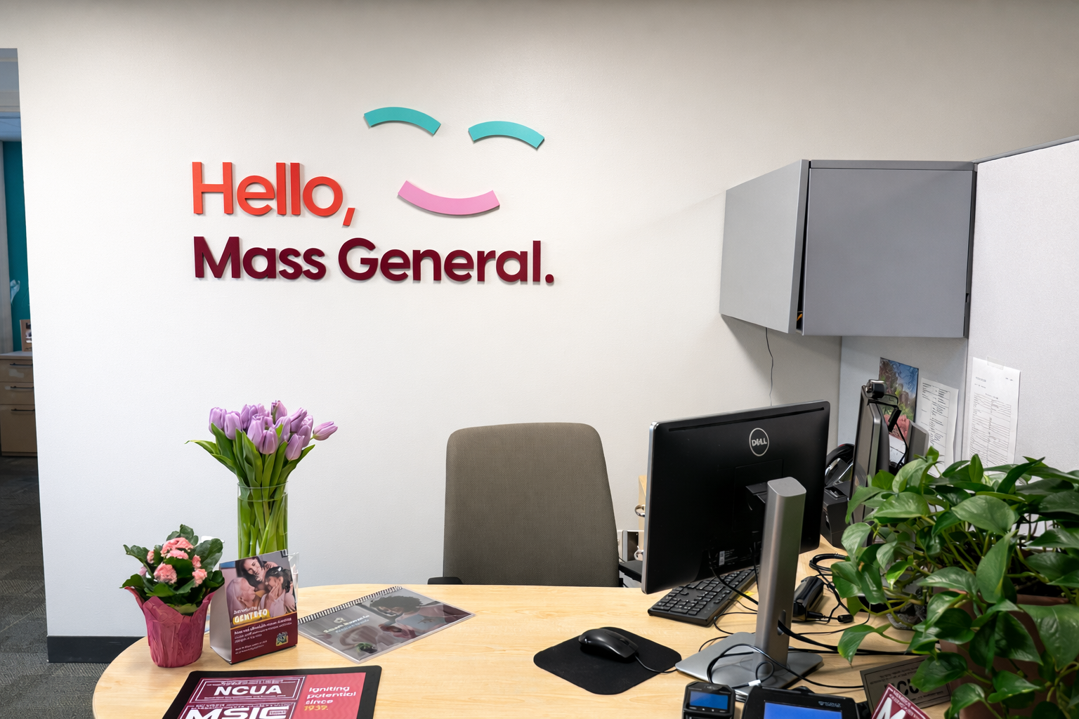
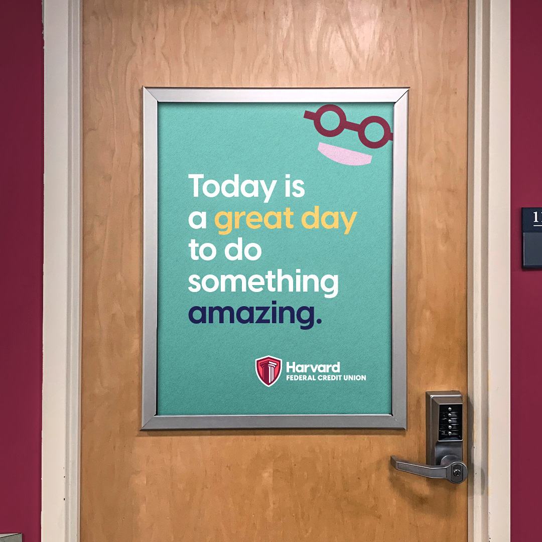
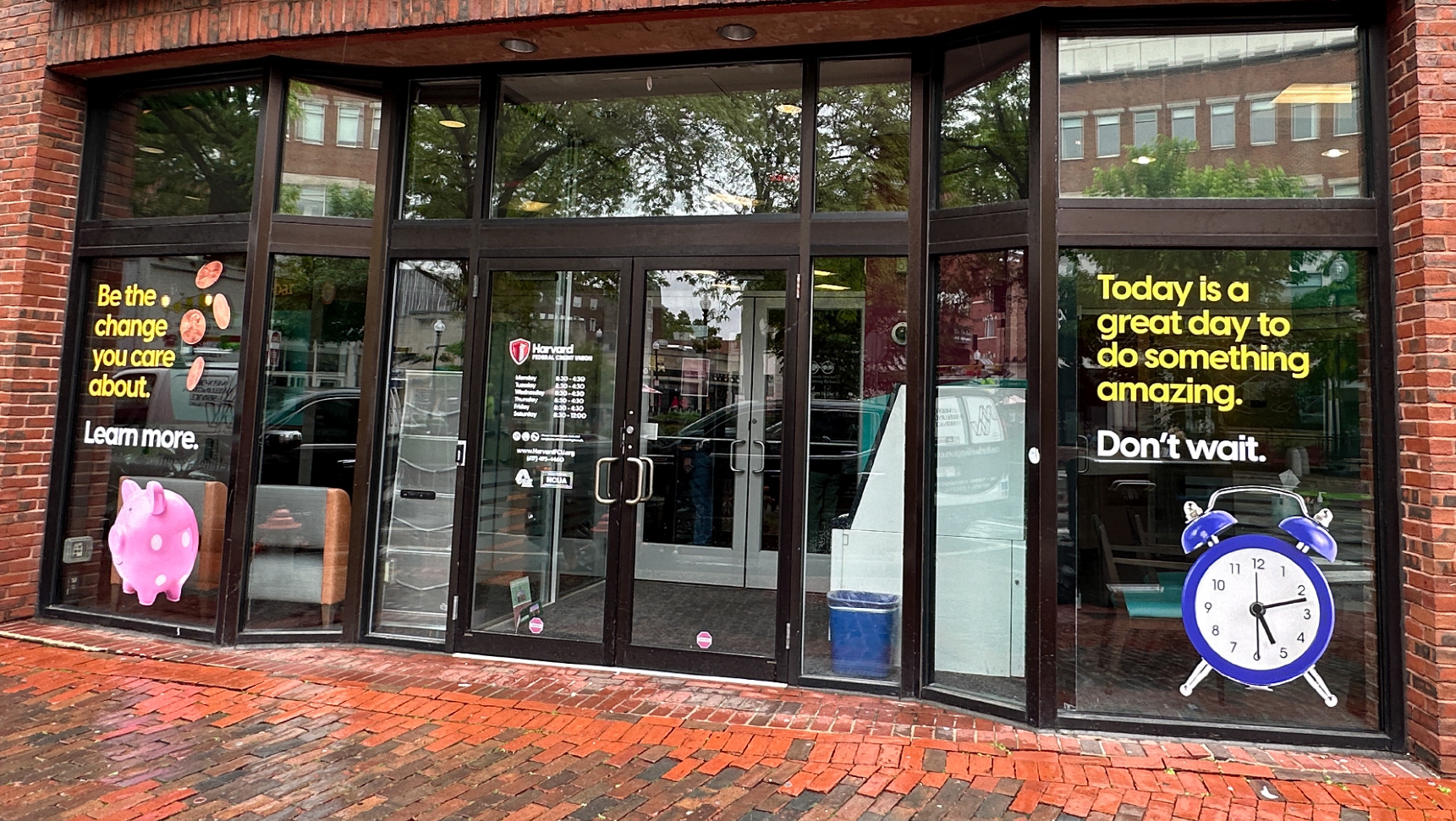
AI Objects
These objects became an added communication tool across marketing materials. The concept of incorporating AI was fully embraced, leading to a small library of assets used across campaigns and in-branch signage.


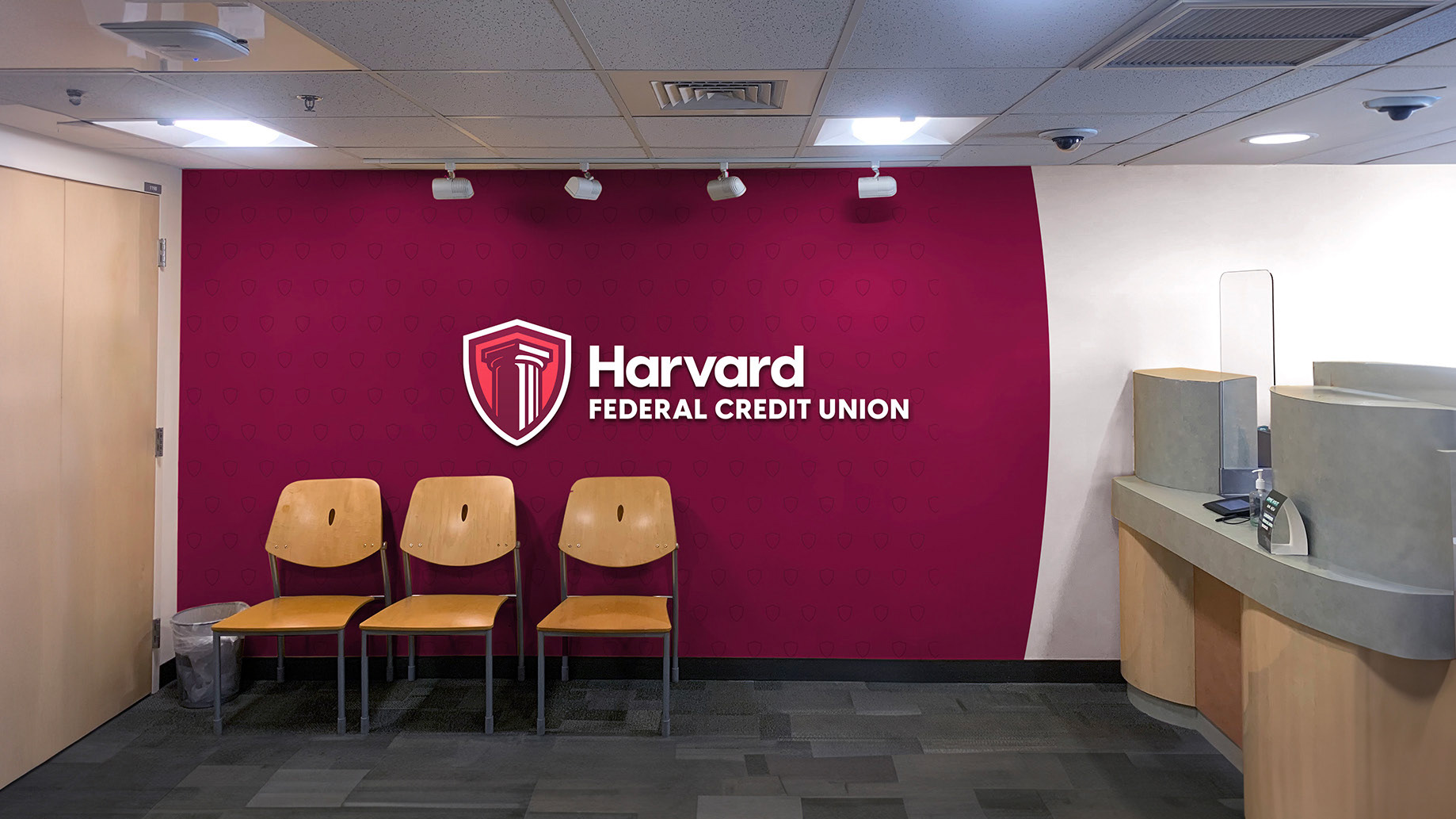
Post-Launch Response
The refreshed brand has been met with strong internal support, with the client responding positively to the more modern and playful visual direction. Throughout the engagement, the team remained flexible and collaborative—adapting to shifting timelines and budget considerations while maintaining momentum across a complex, multi-phase rollout.