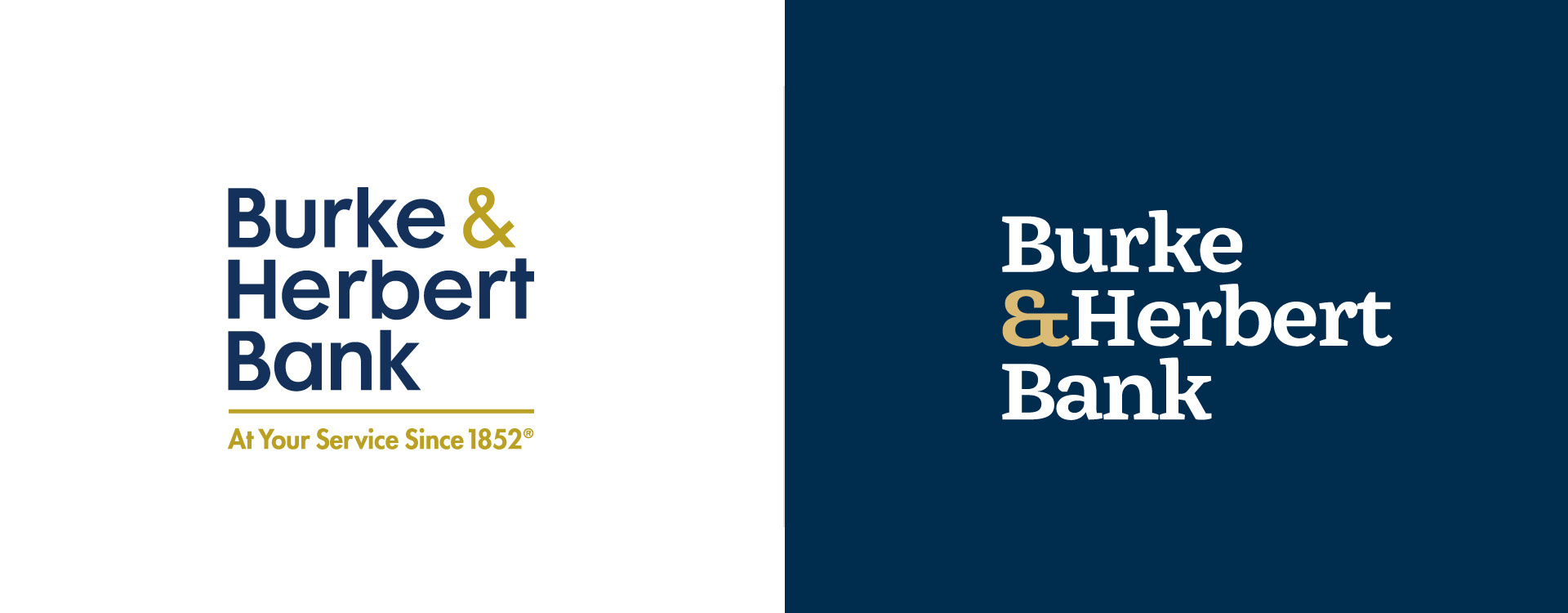
Logo Before & After

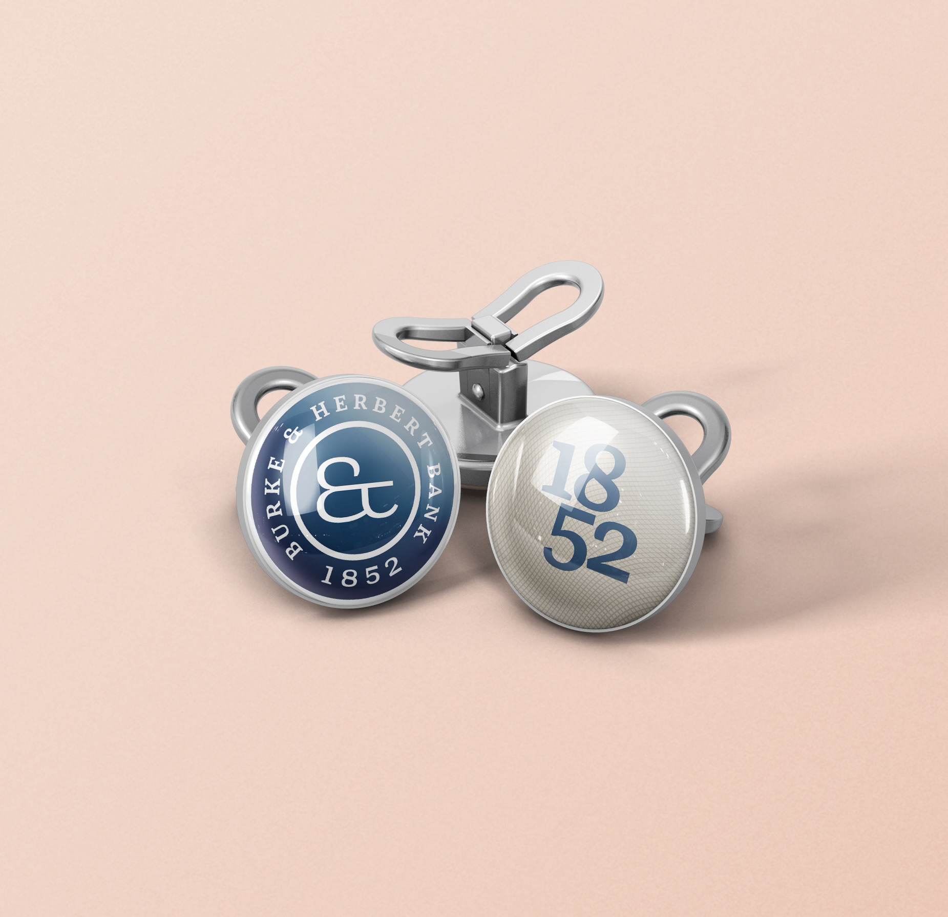
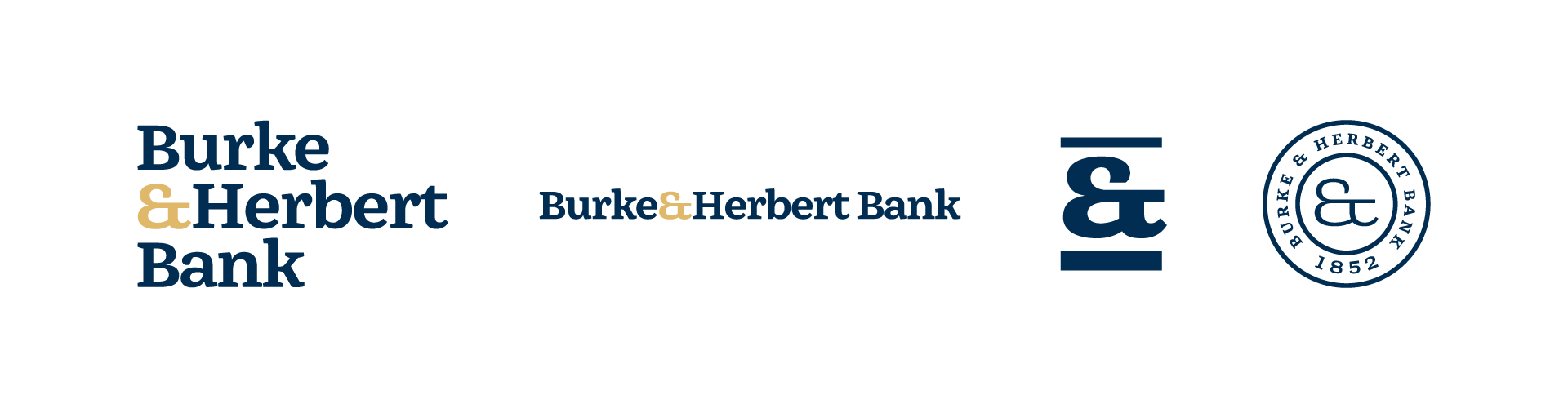
Logo Mark
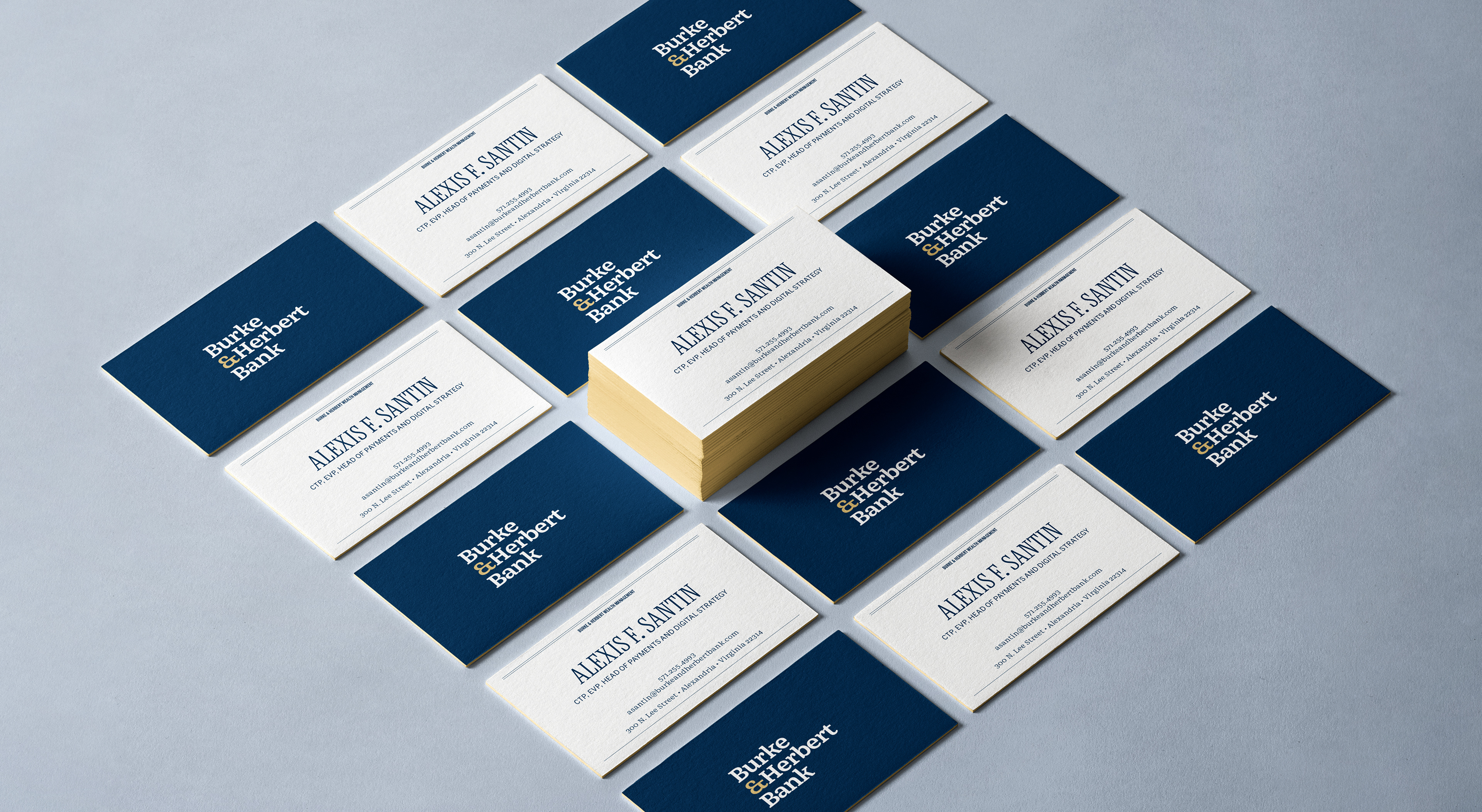
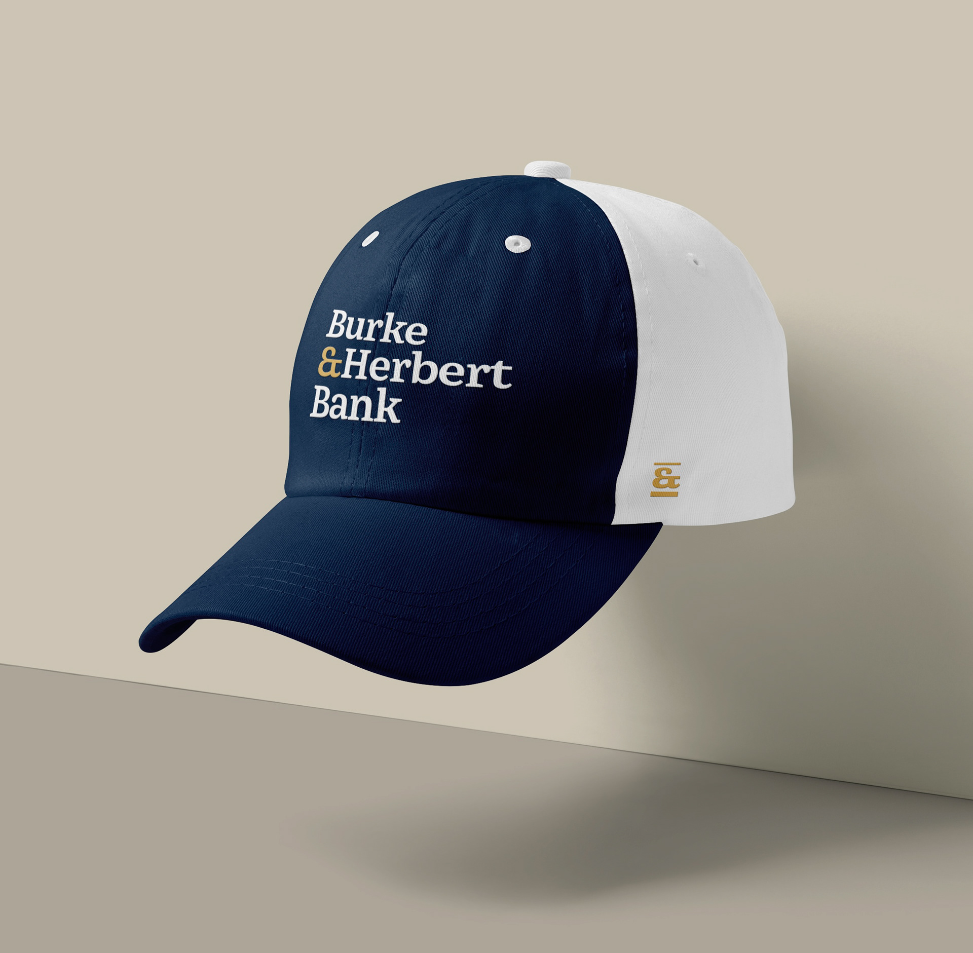
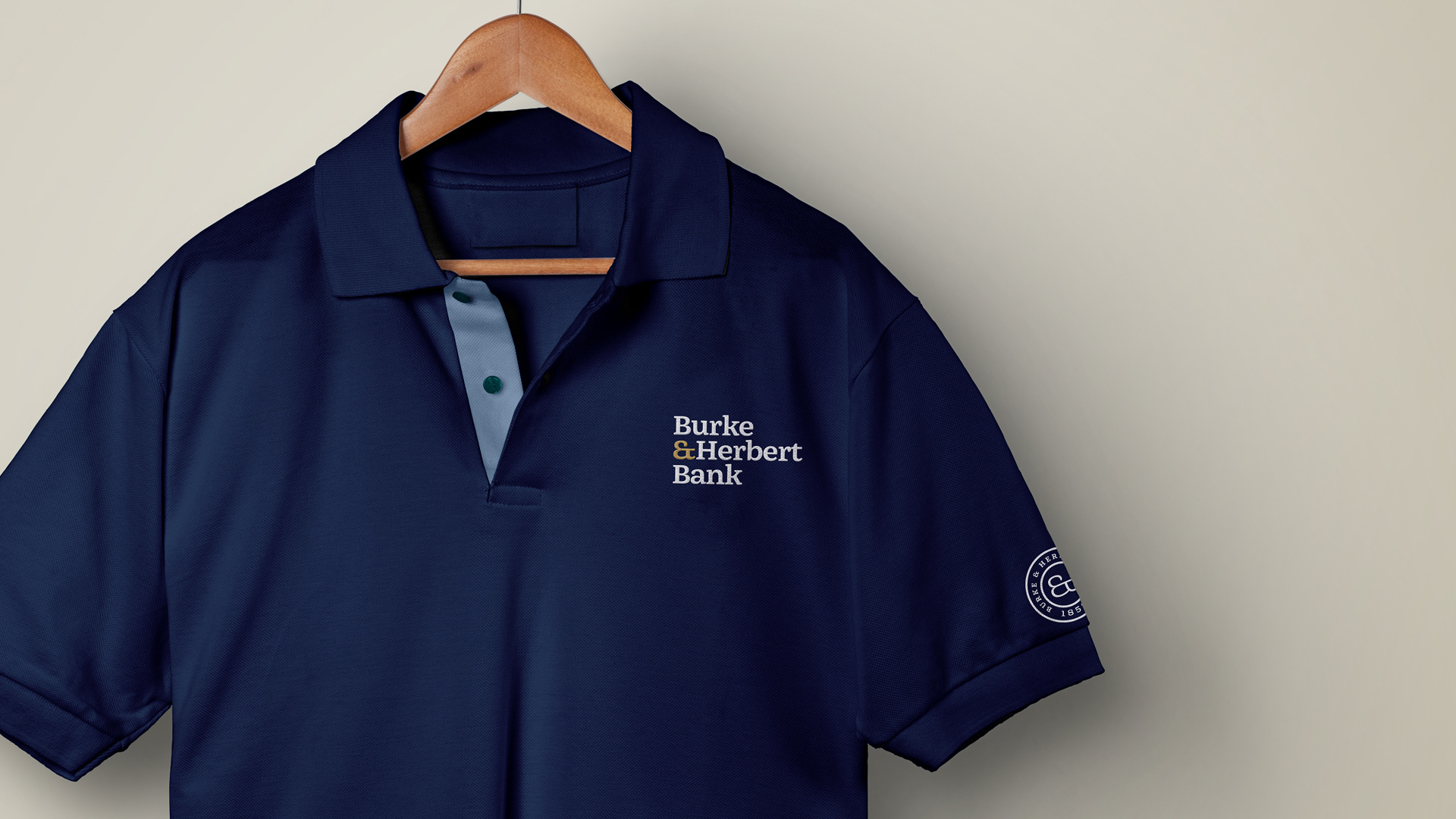
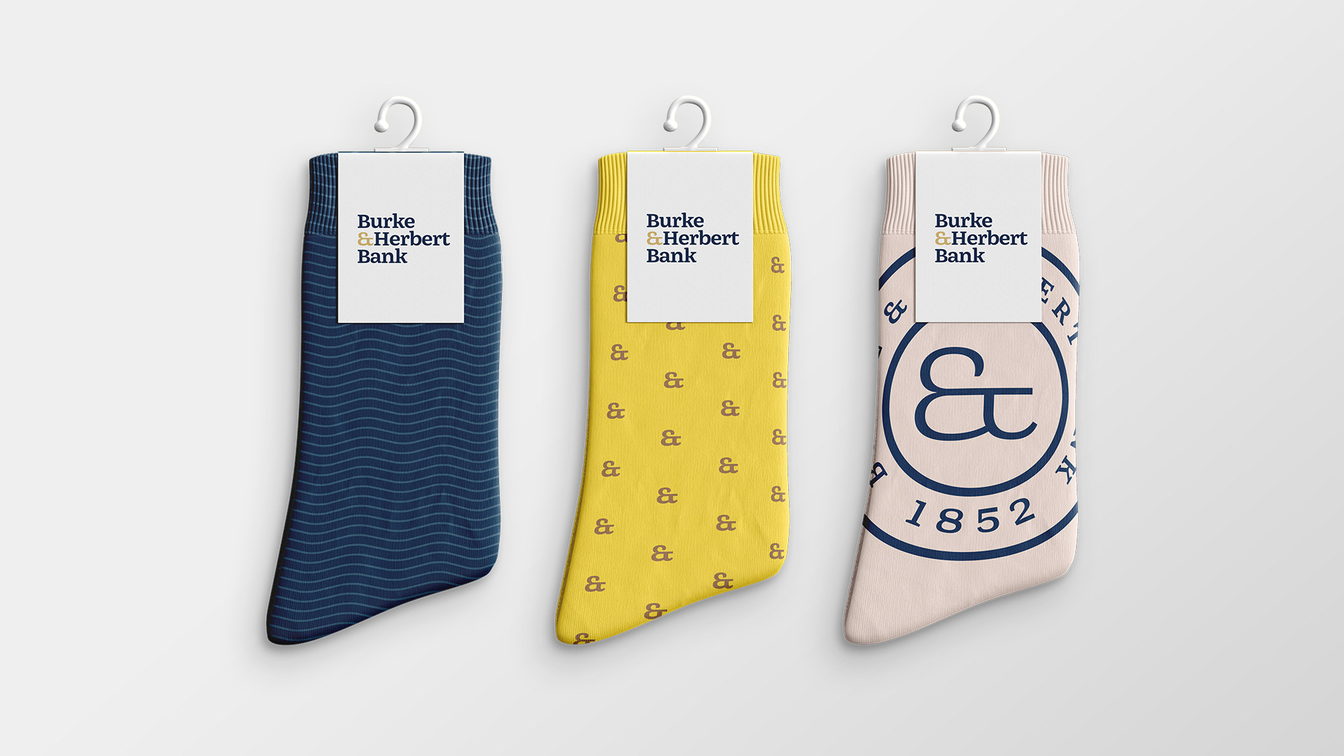
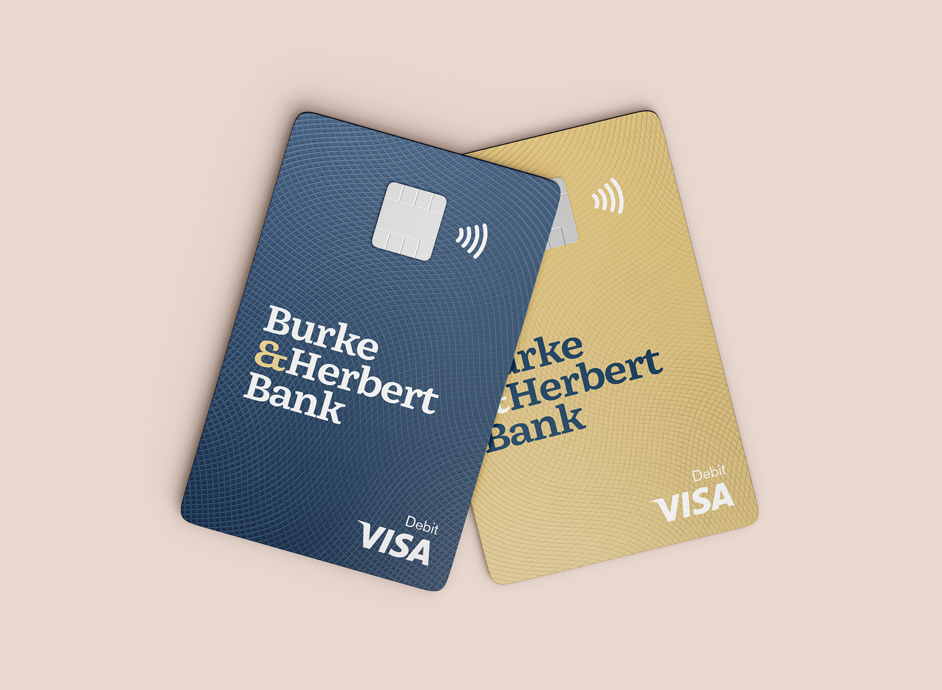
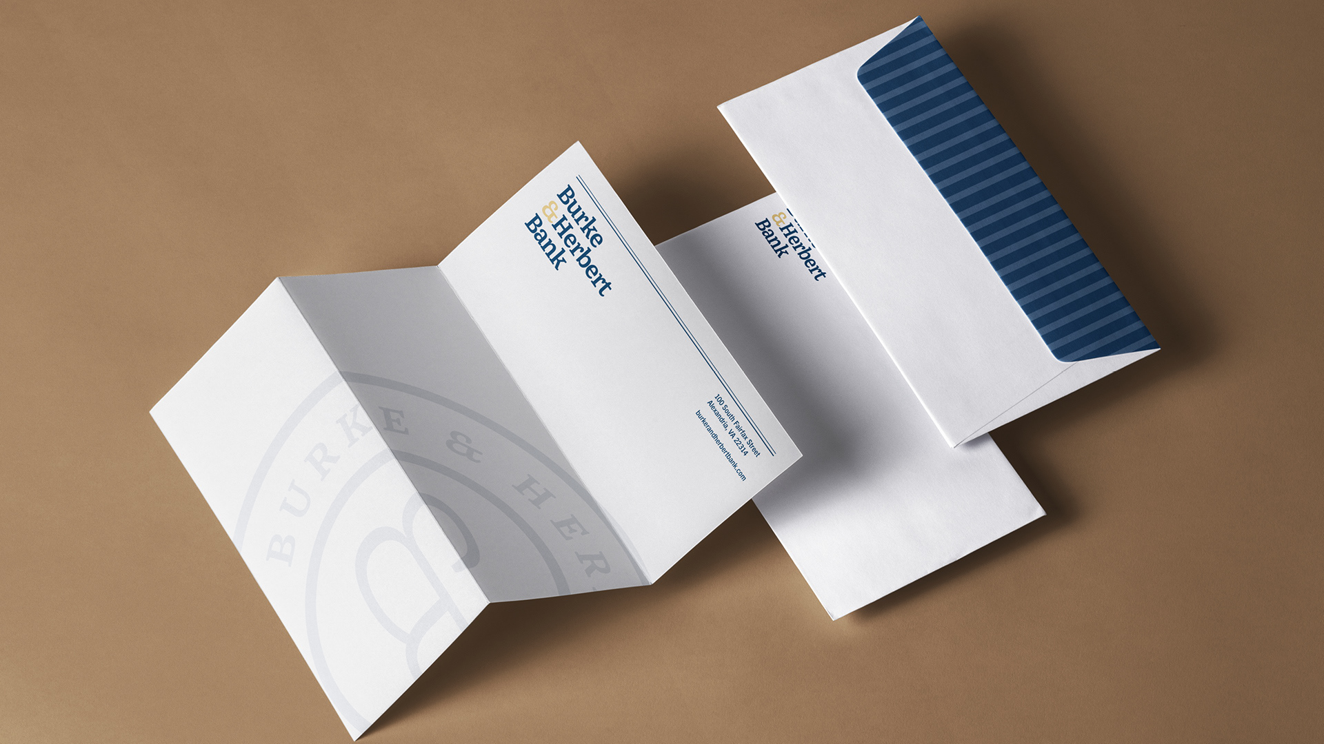
The wordmark mixes a modern serif with custom letterforms to keep it refined but approachable. A standout ampersand adds a unique touch, and giving “Bank” equal weight makes the name feel clear and confident.
Brand Video
Brand Colors
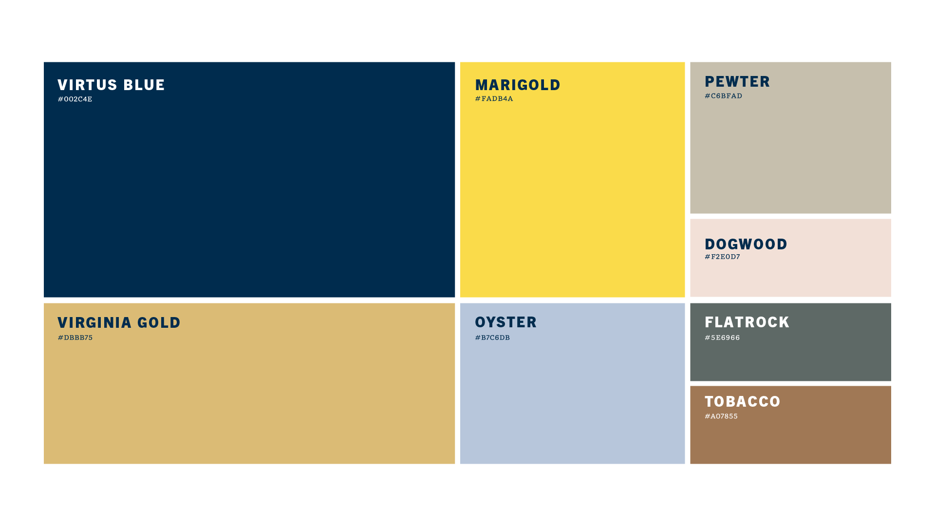
We kept Burke & Herbert’s core colors and added a set of refined secondary tones inspired by the Virginia landscape, giving the palette more warmth and flexibility while still feeling timeless.
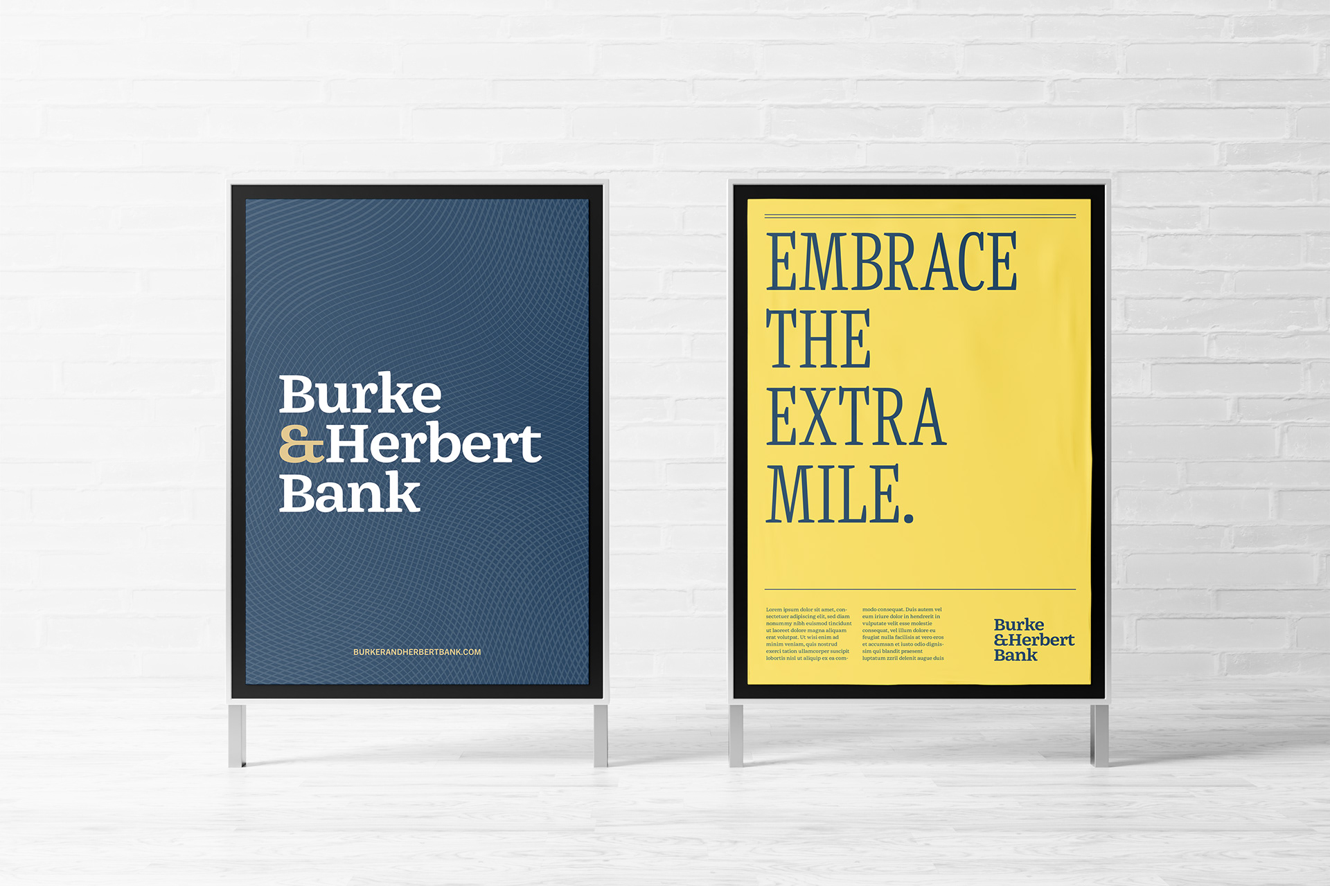
Visual Identity
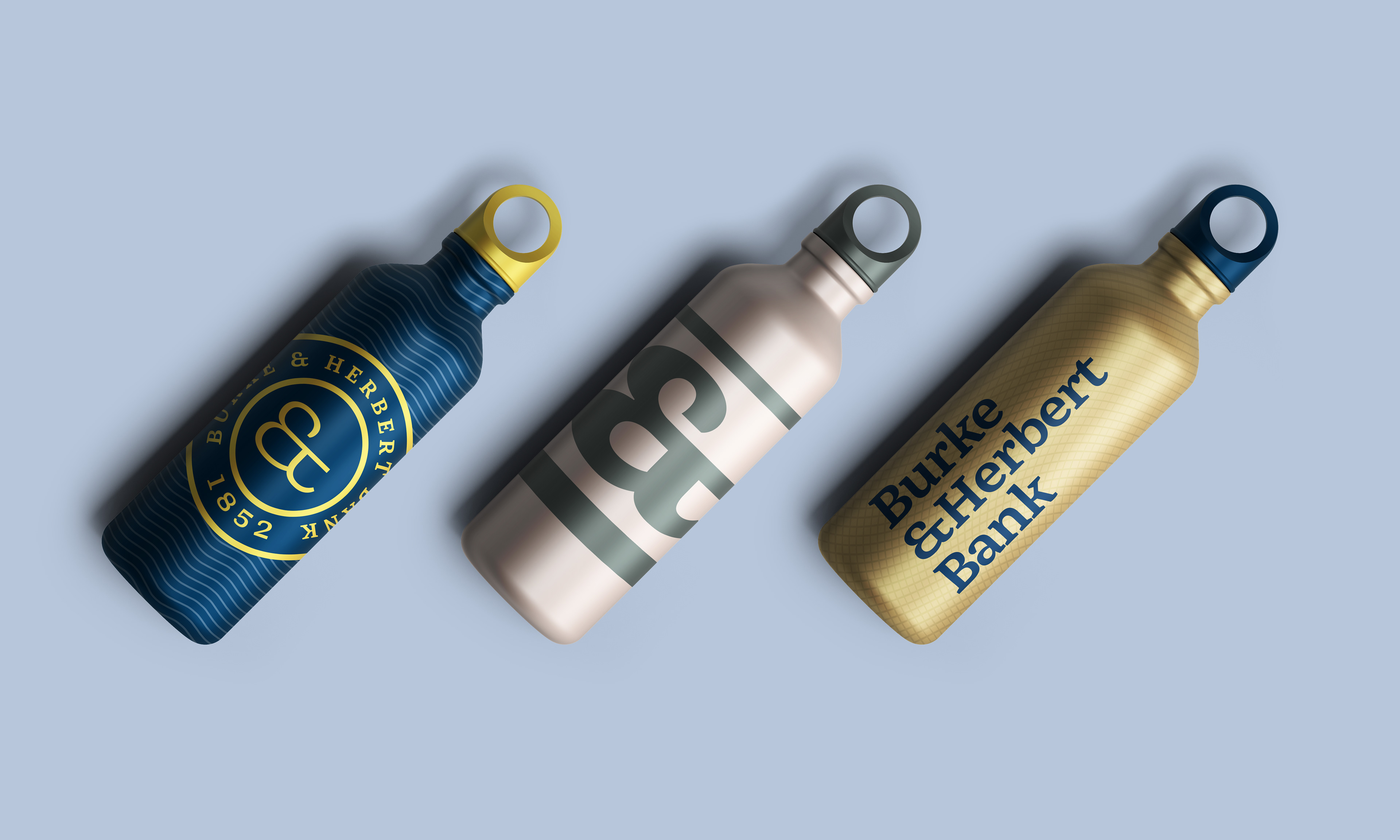
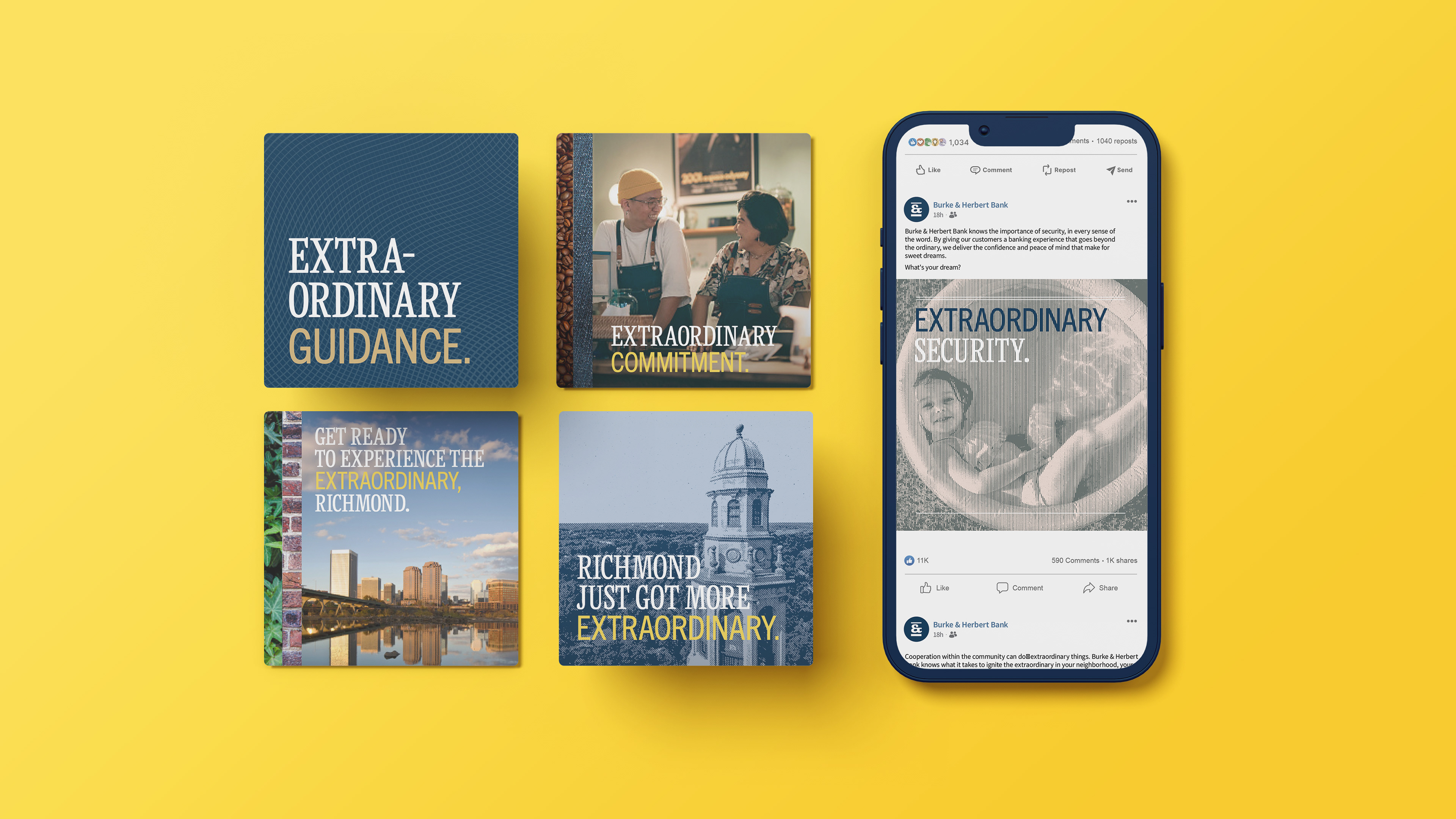
The visual identity draws inspiration from letterpress and engraving techniques, grounding the system in a dynamic yet sophisticated aesthetic. Textured overlays are used to transform photography into illustration-like graphics, adding depth and character across applications.
Brand Photography
Their curated stock photography library leans into editorial-style imagery that feels cohesive and story-driven. Each image captures candid, everyday moments, making the brand feel more human and relatable.