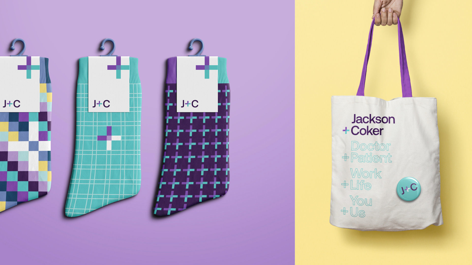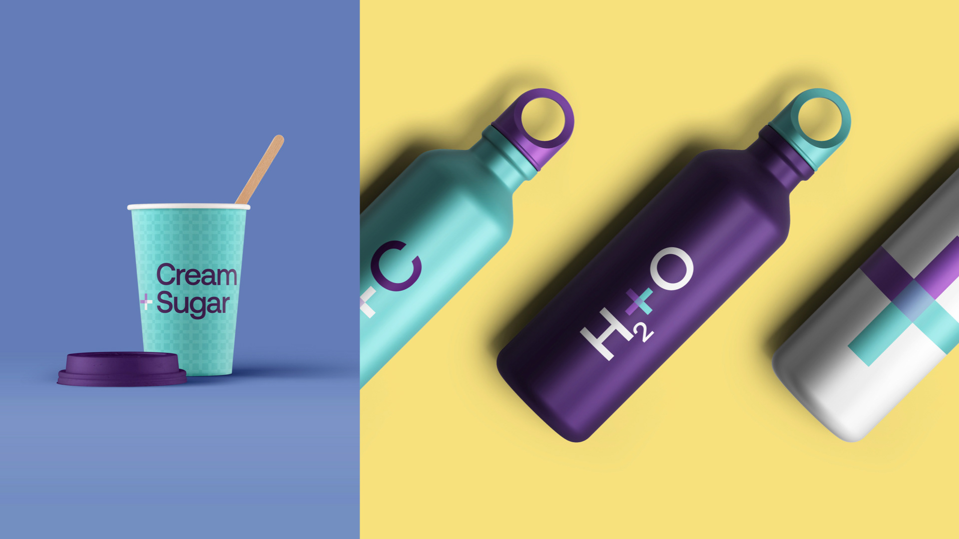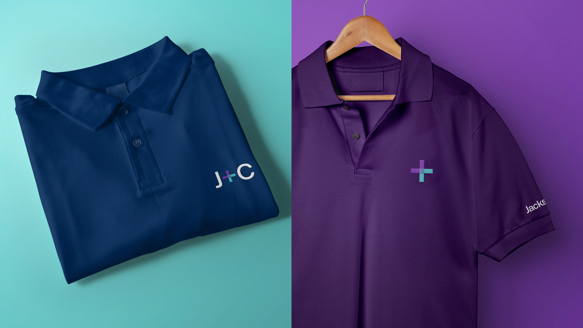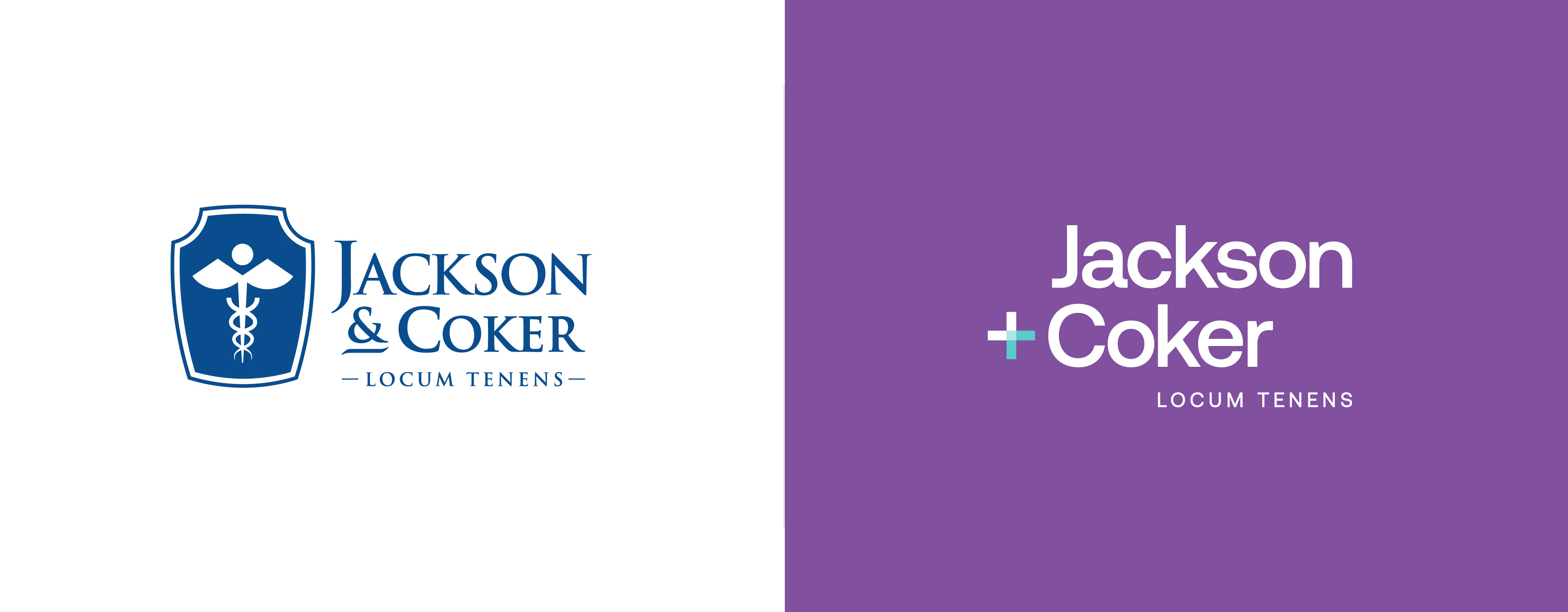
Logo Before & After

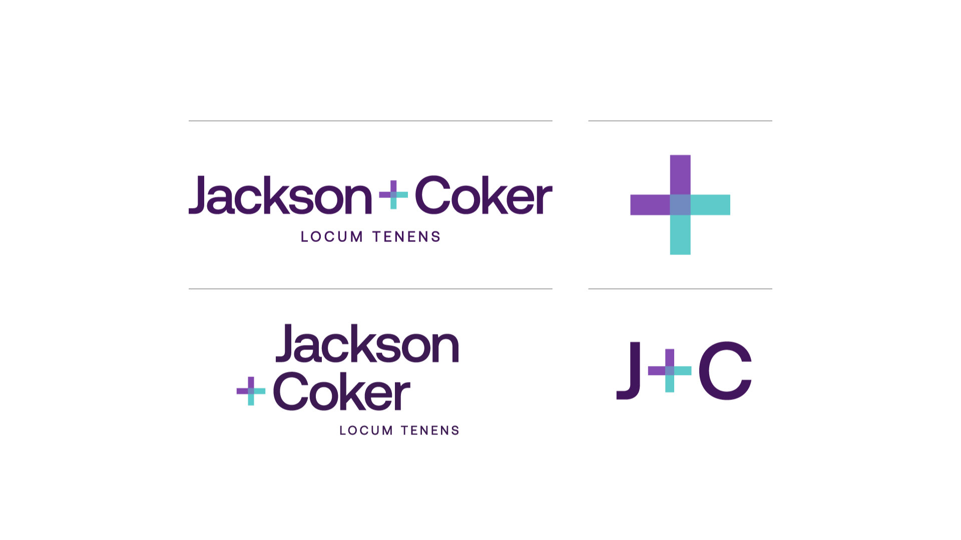
Logo Design
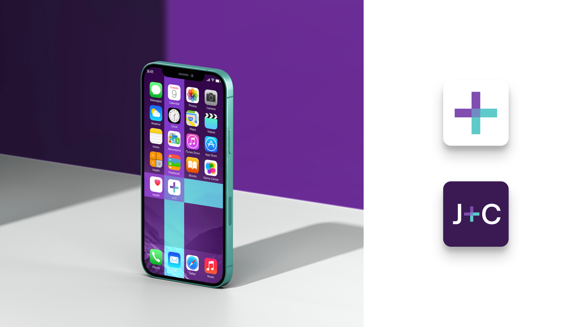
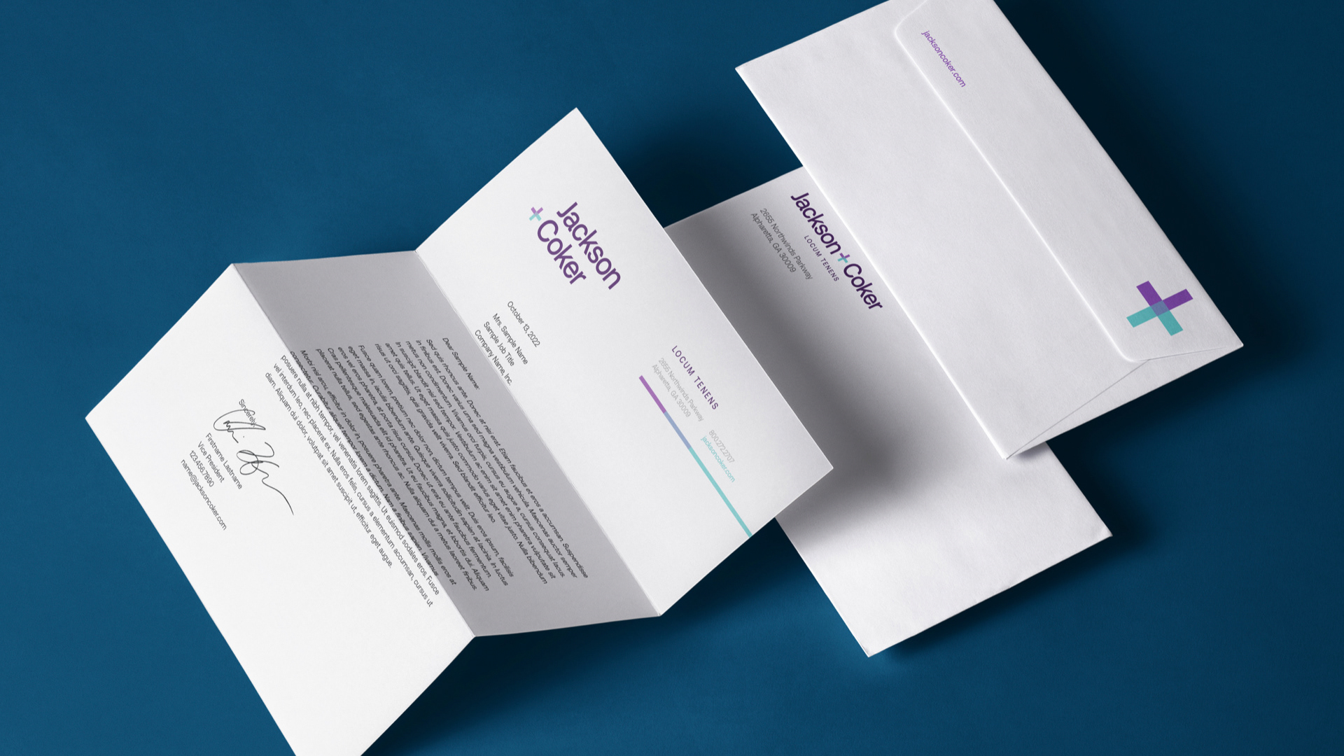
Two arrows connect to form the brand mark. In that connection lives the strength that powers J+C—the moment where relationships are born and continue to grow.
Telling the Jackson + Coker Story
The story behind Jackson + Coker became the heart of the brand video. A clean, simple execution allowed the brand elements and custom illustrations to take center stage.
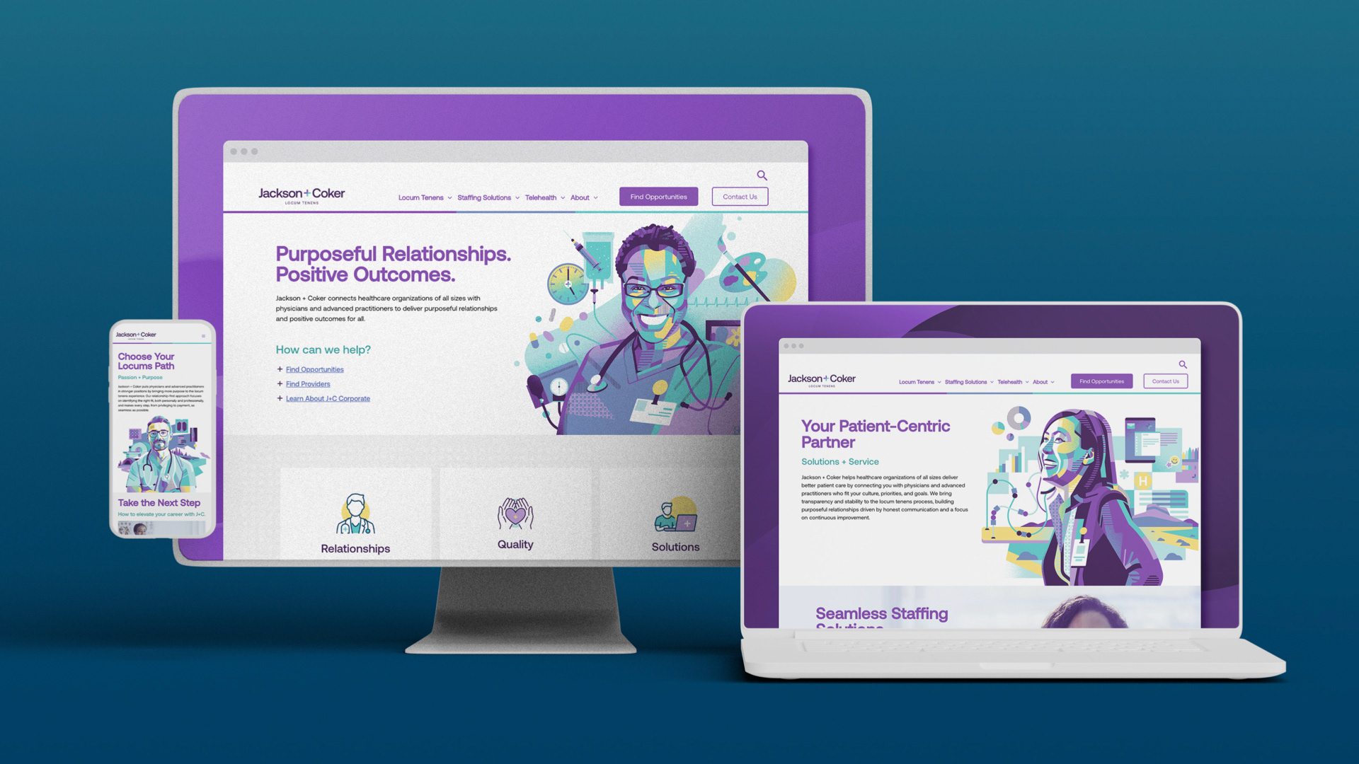
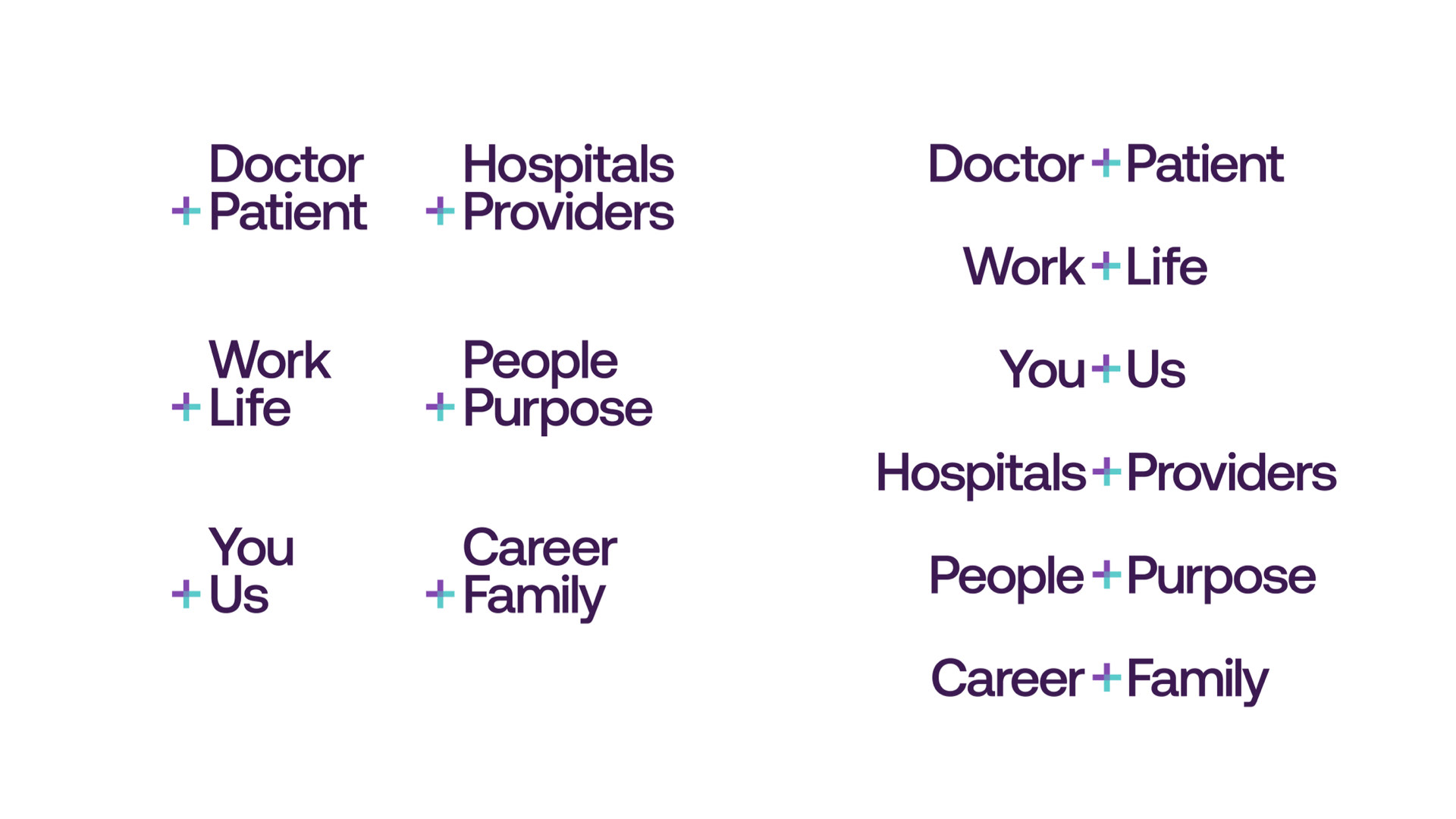
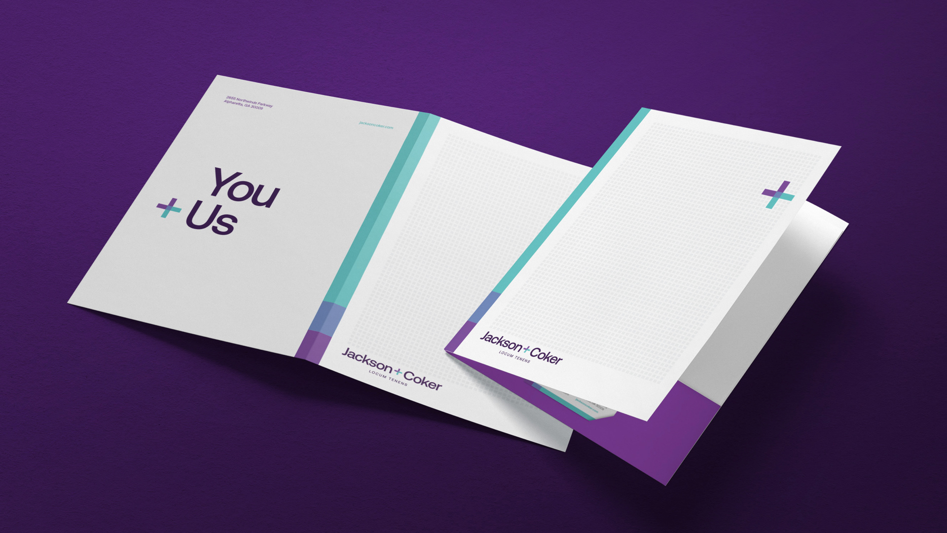
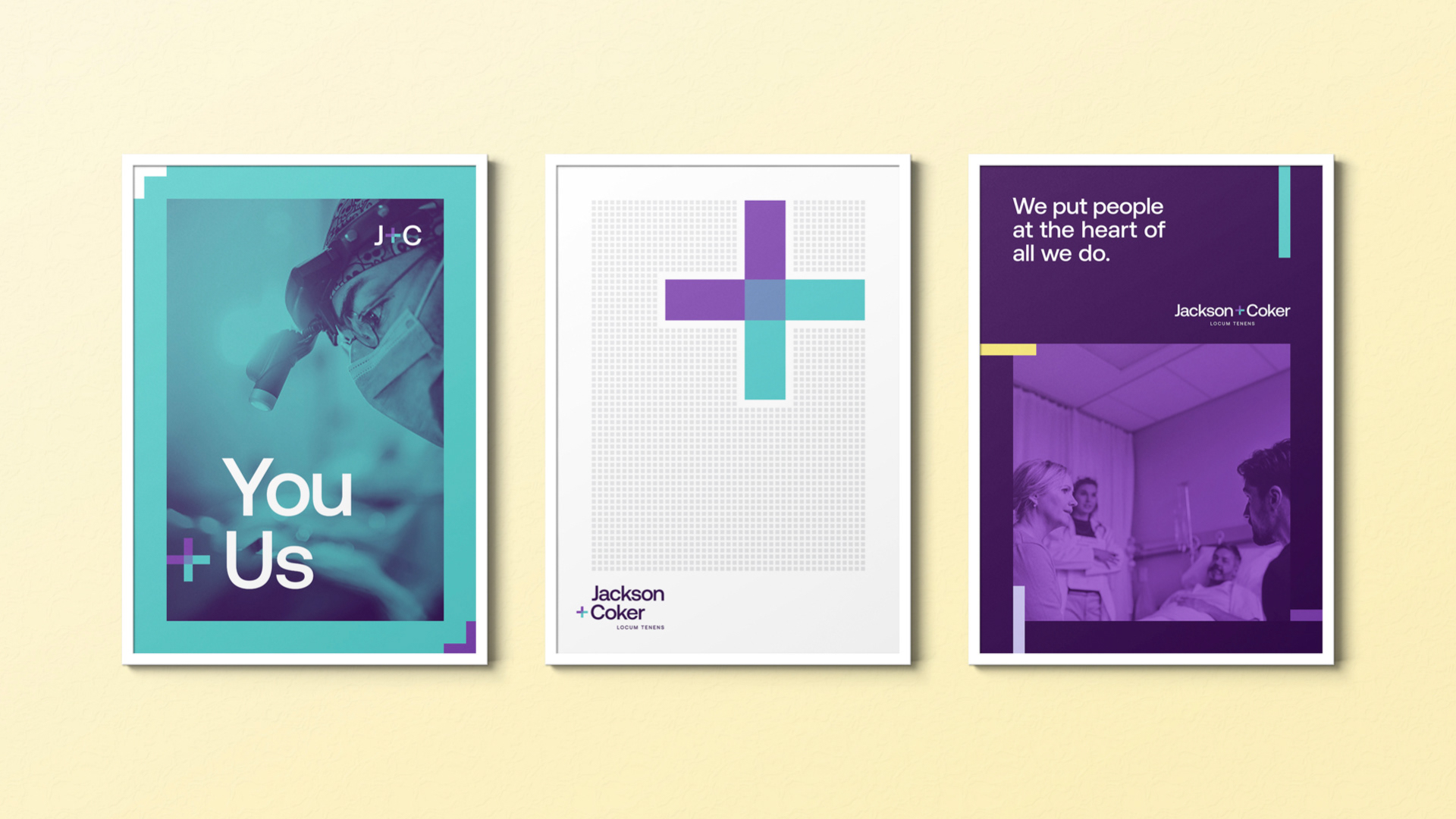
Purposeful relationships.
Positive outcomes.
Positive outcomes.
Aka, their heart + soul. Every connection Jackson + Coker facilitates is with the goal of building stronger, more meaningful relationships, ultimately leading to healthier outcomes for all.
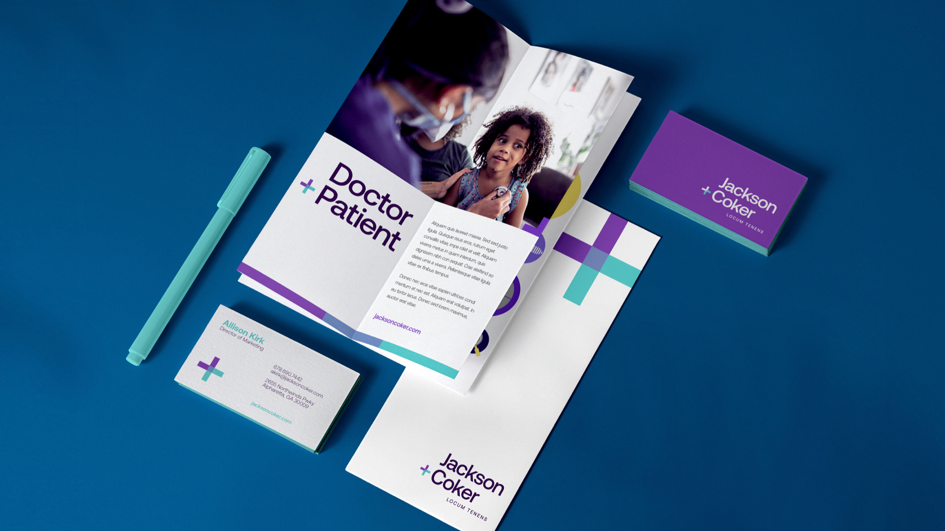
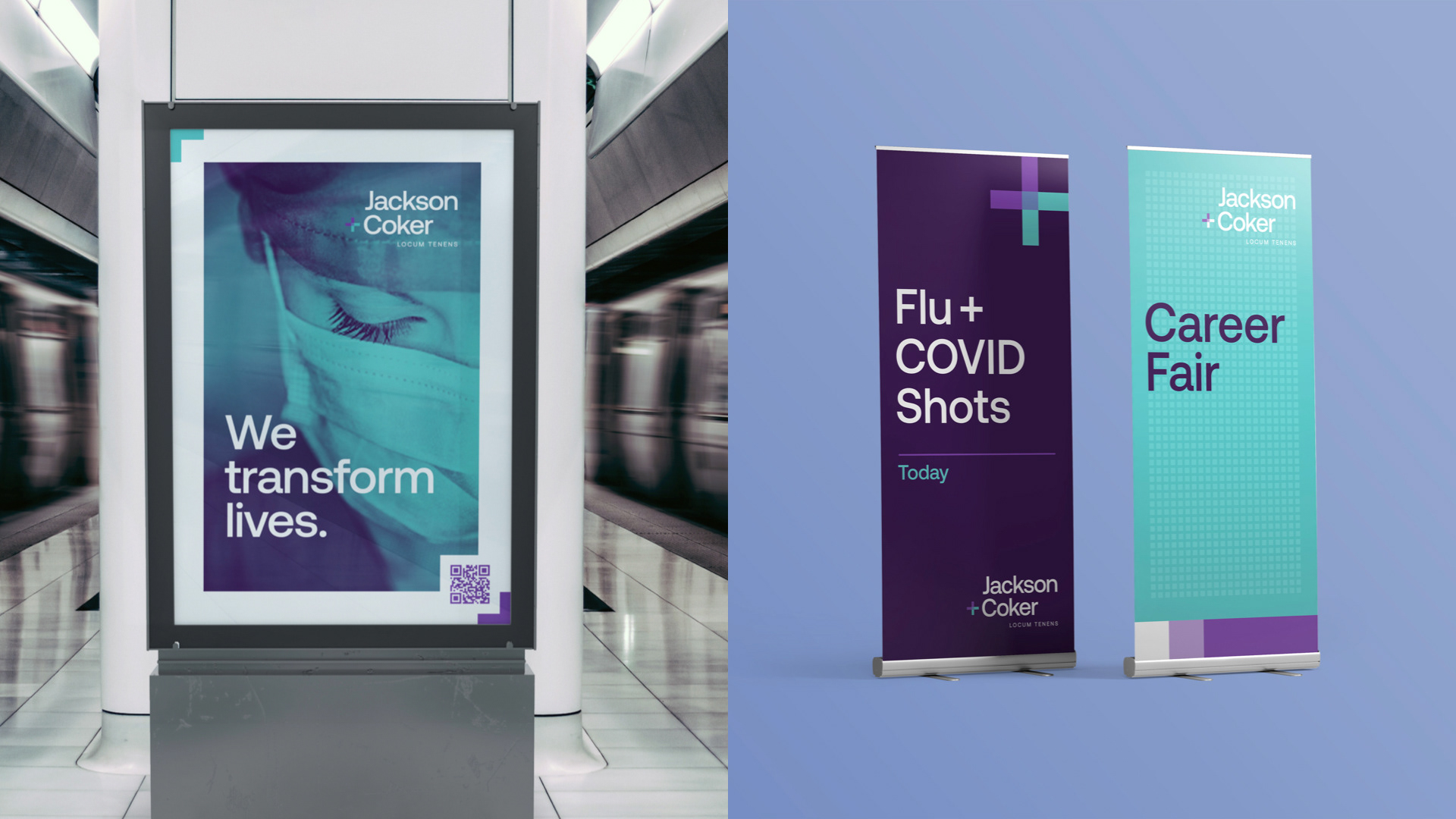
Brand Photography
The photography takes two directions: Shared Moments and Healthcare Details. Paired with a branded color treatment, both highlight the positive, real-life experiences of locum tenens doctors and their patients.


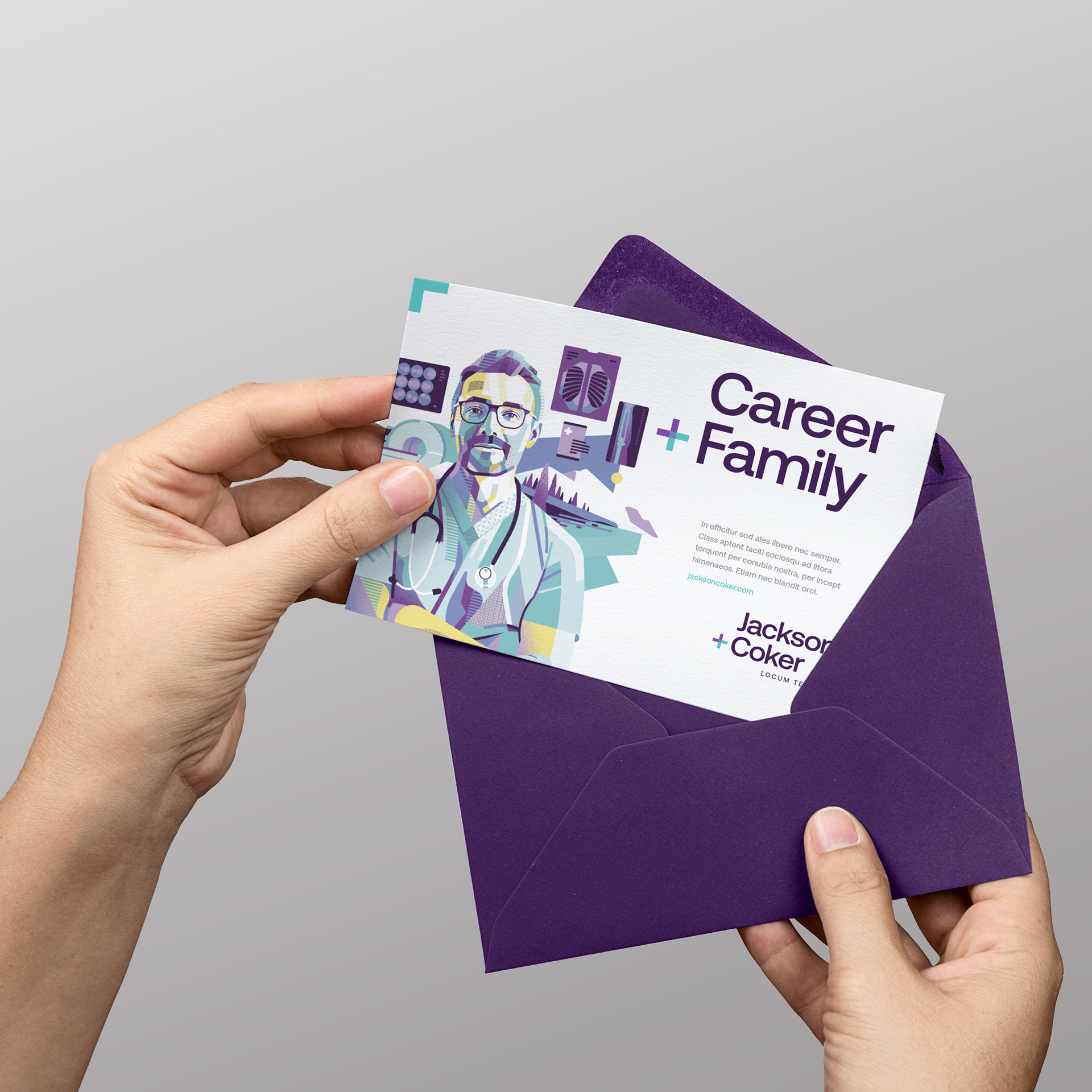
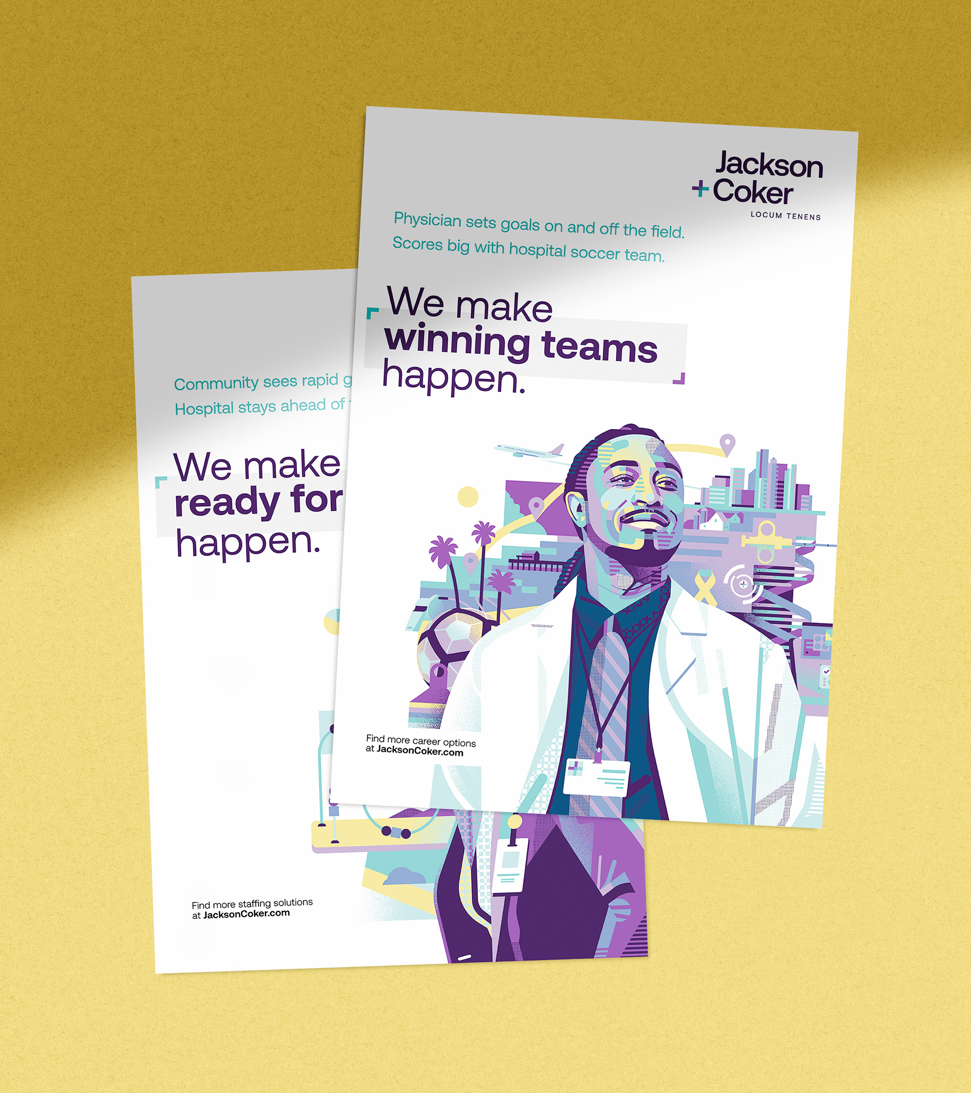
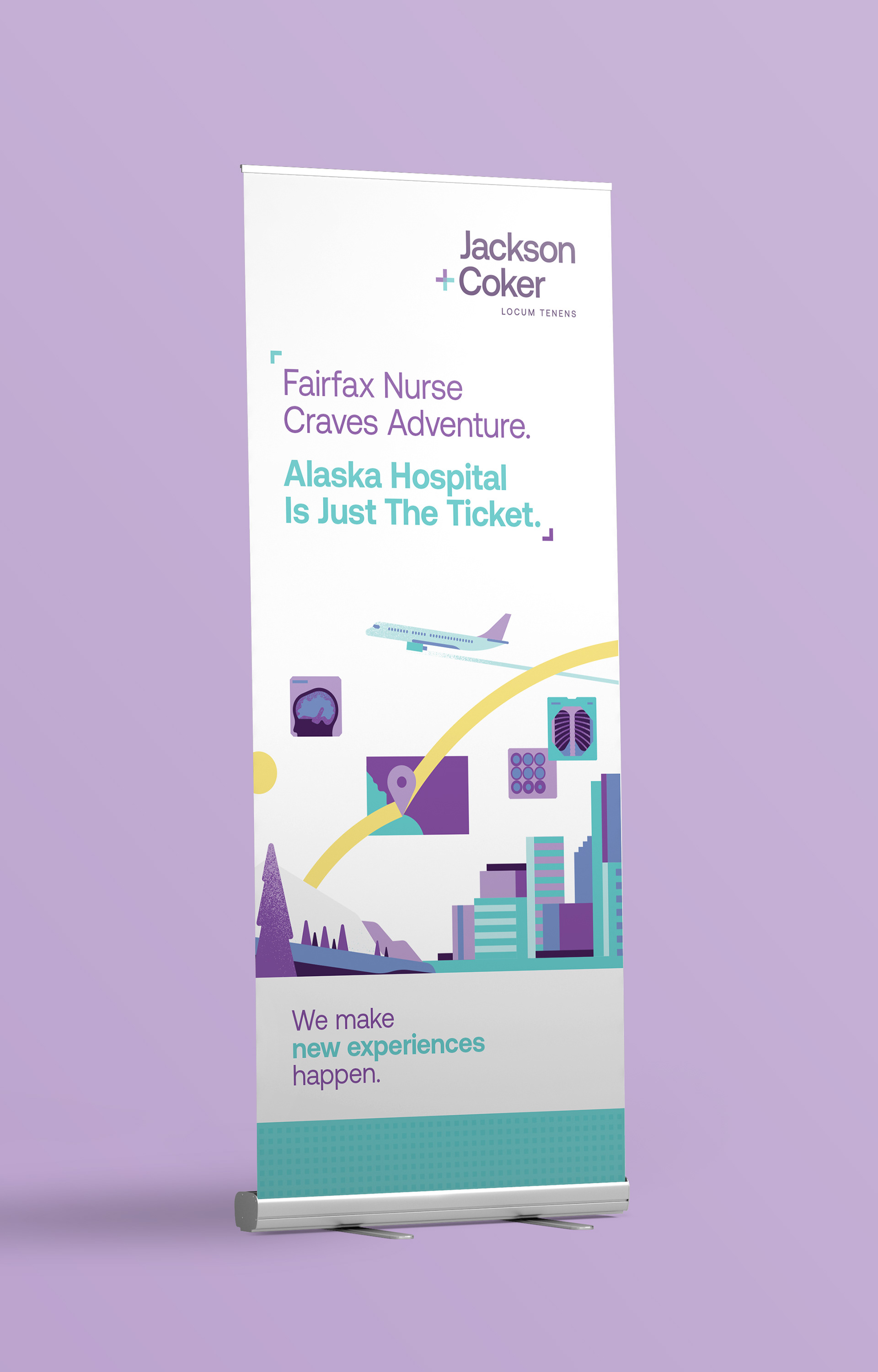
Custom Illustration
In a space where everything starts to feel the same, original artwork sets a different tone.
Partnering with Aleksandar Savic, we created bold digital illustrations that shift the focus beyond price. Grounded in real moments, the visuals blend brand patterns with portraiture to reflect today’s healthcare professionals and administrators.
Partnering with Aleksandar Savic, we created bold digital illustrations that shift the focus beyond price. Grounded in real moments, the visuals blend brand patterns with portraiture to reflect today’s healthcare professionals and administrators.