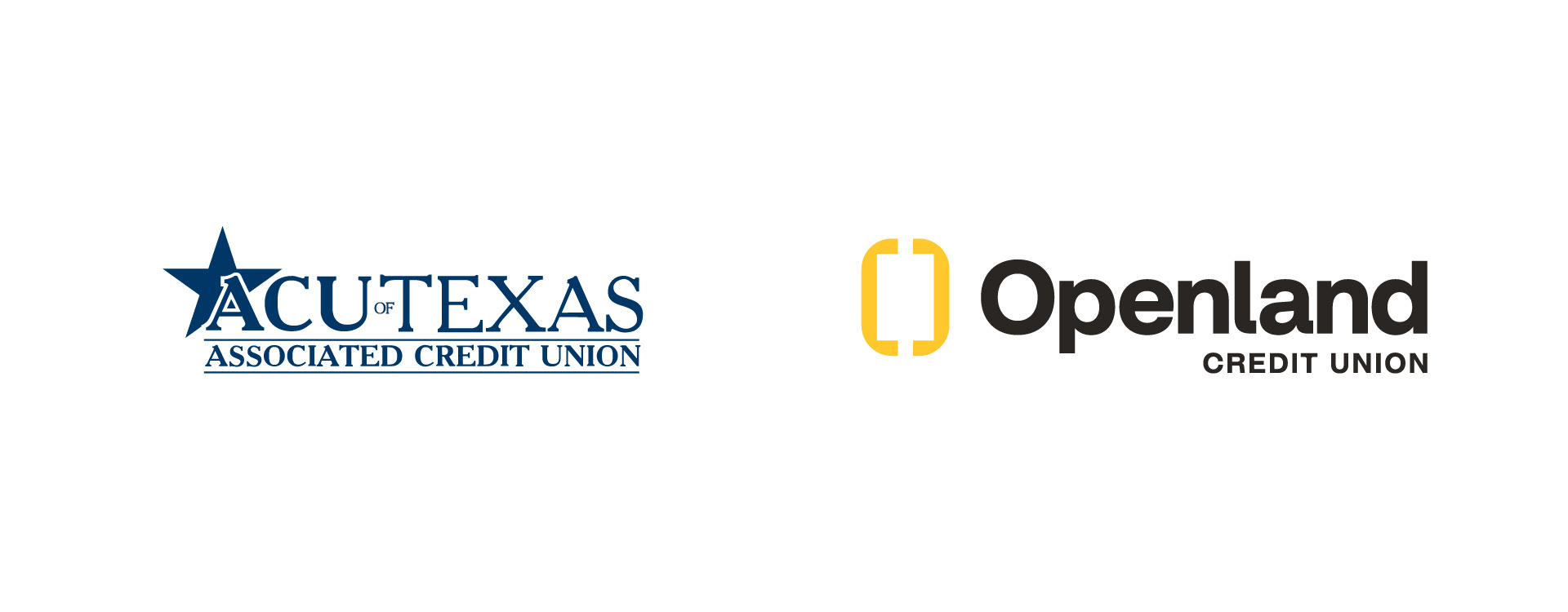
Logo Before & After
The Doorway
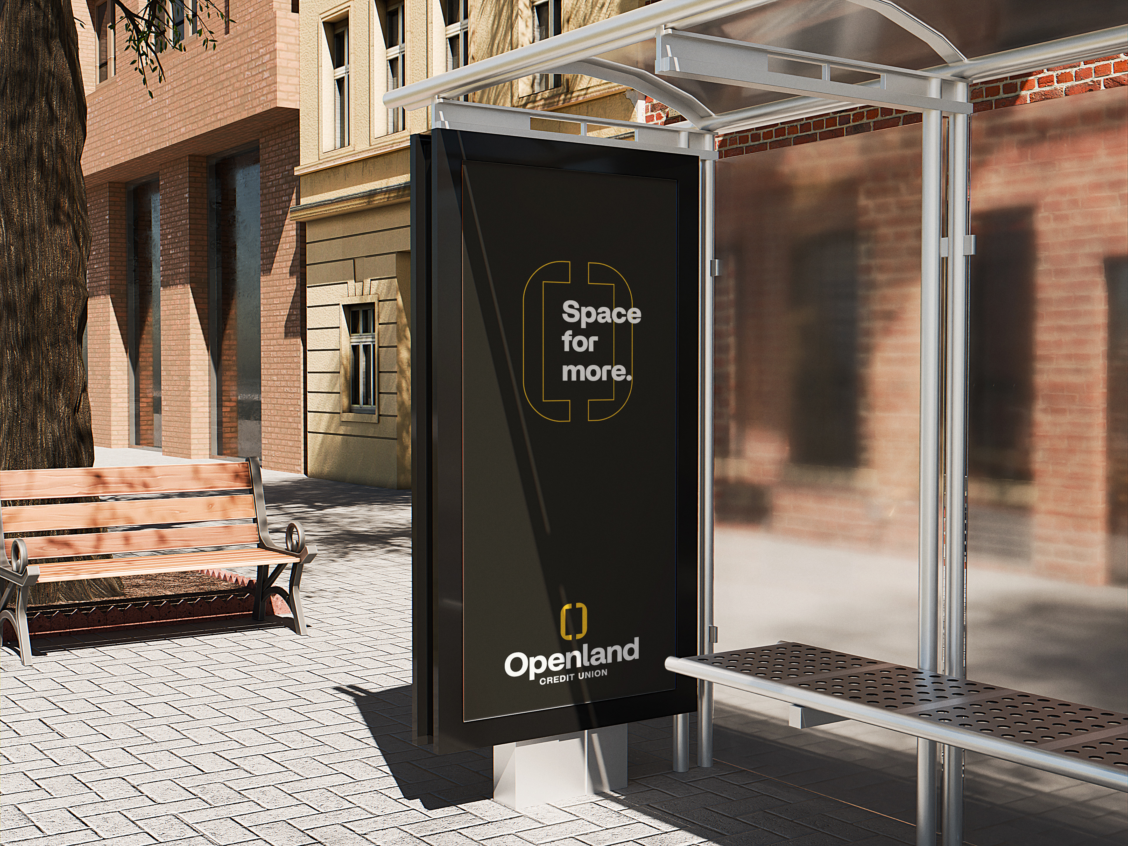
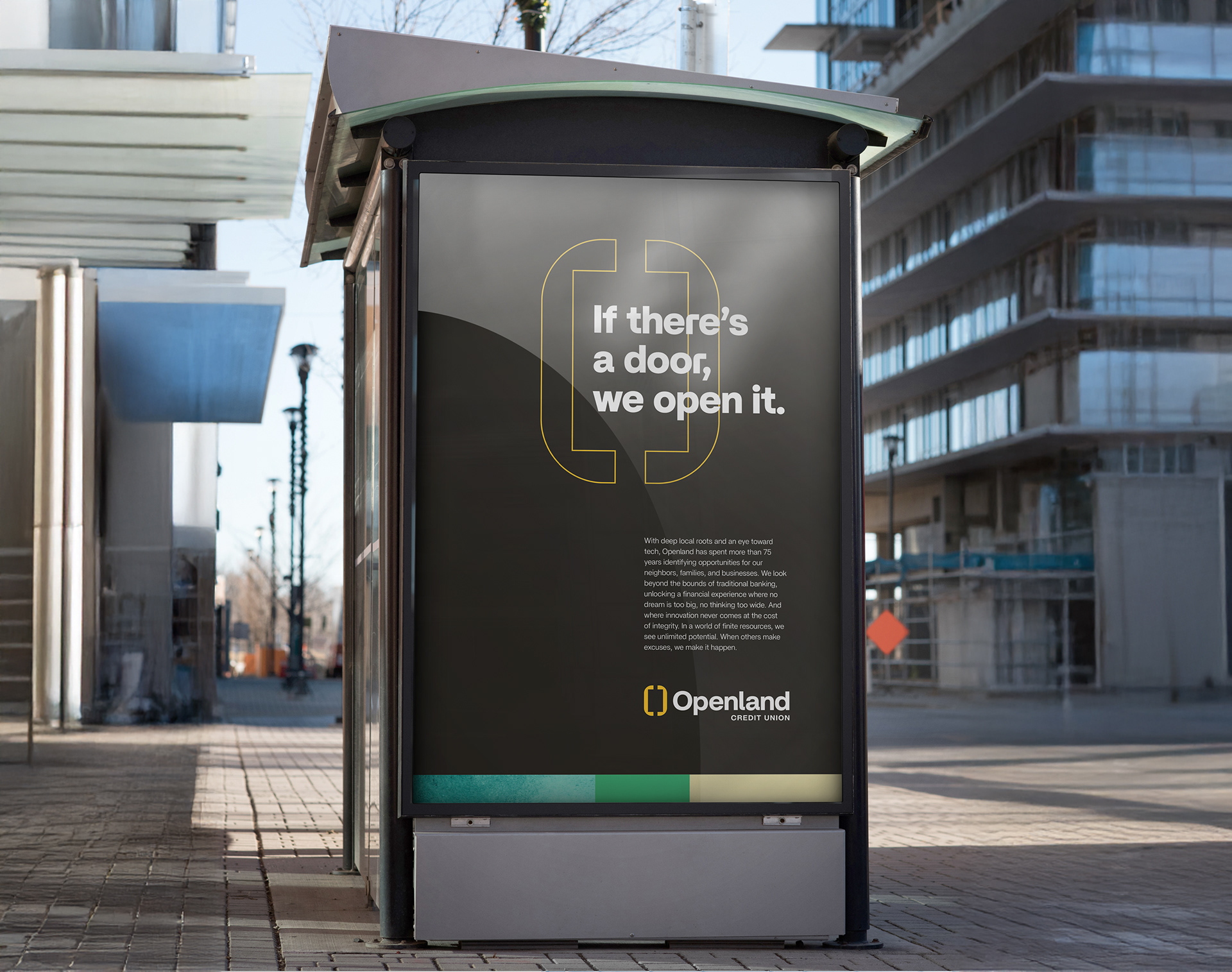
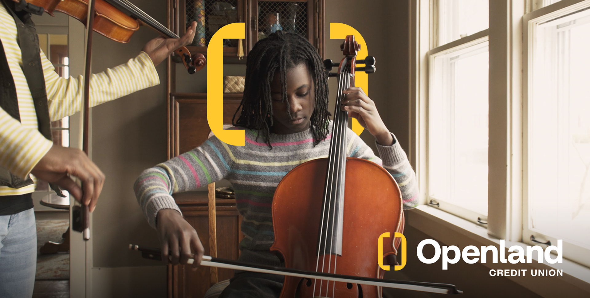
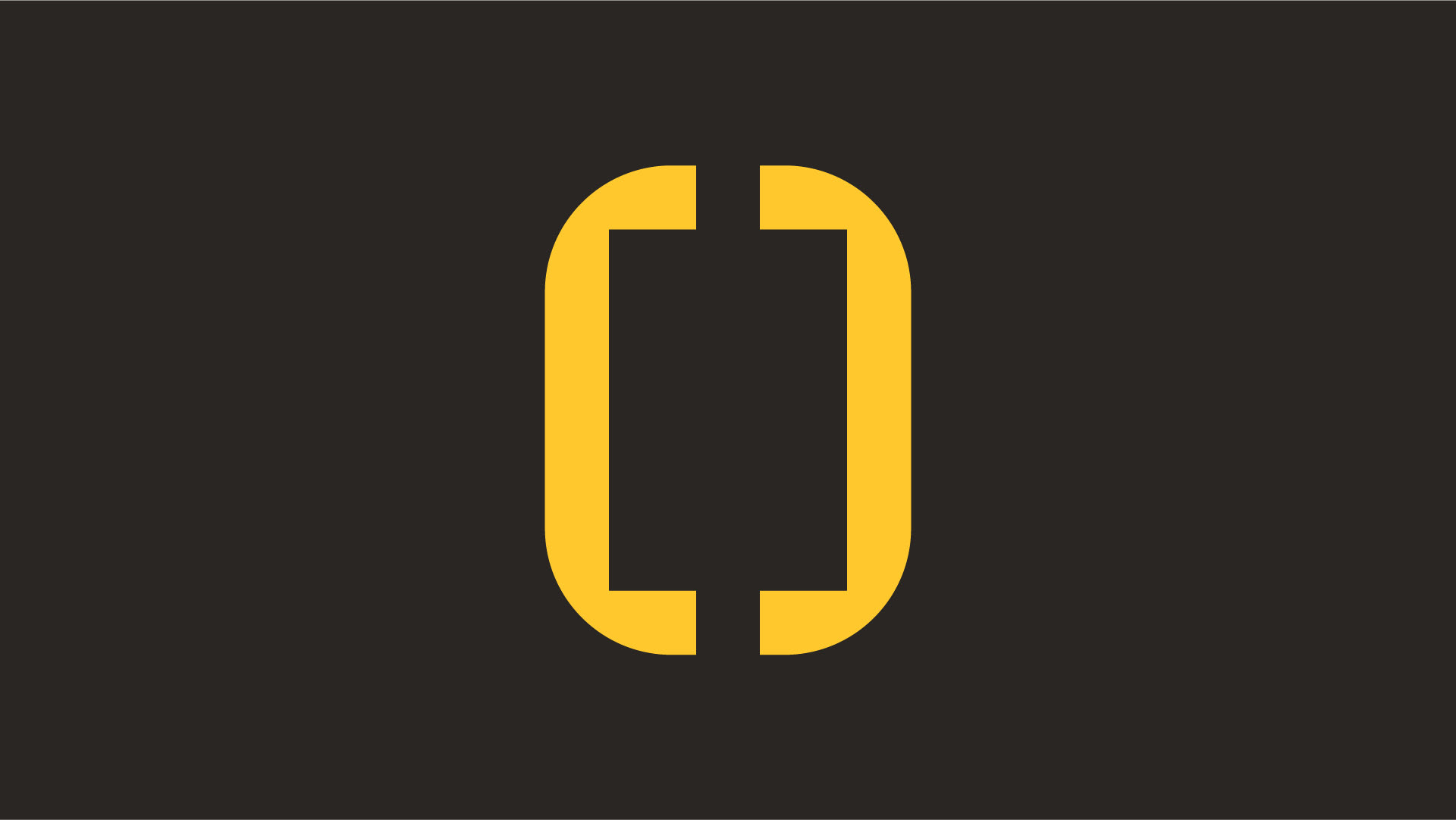
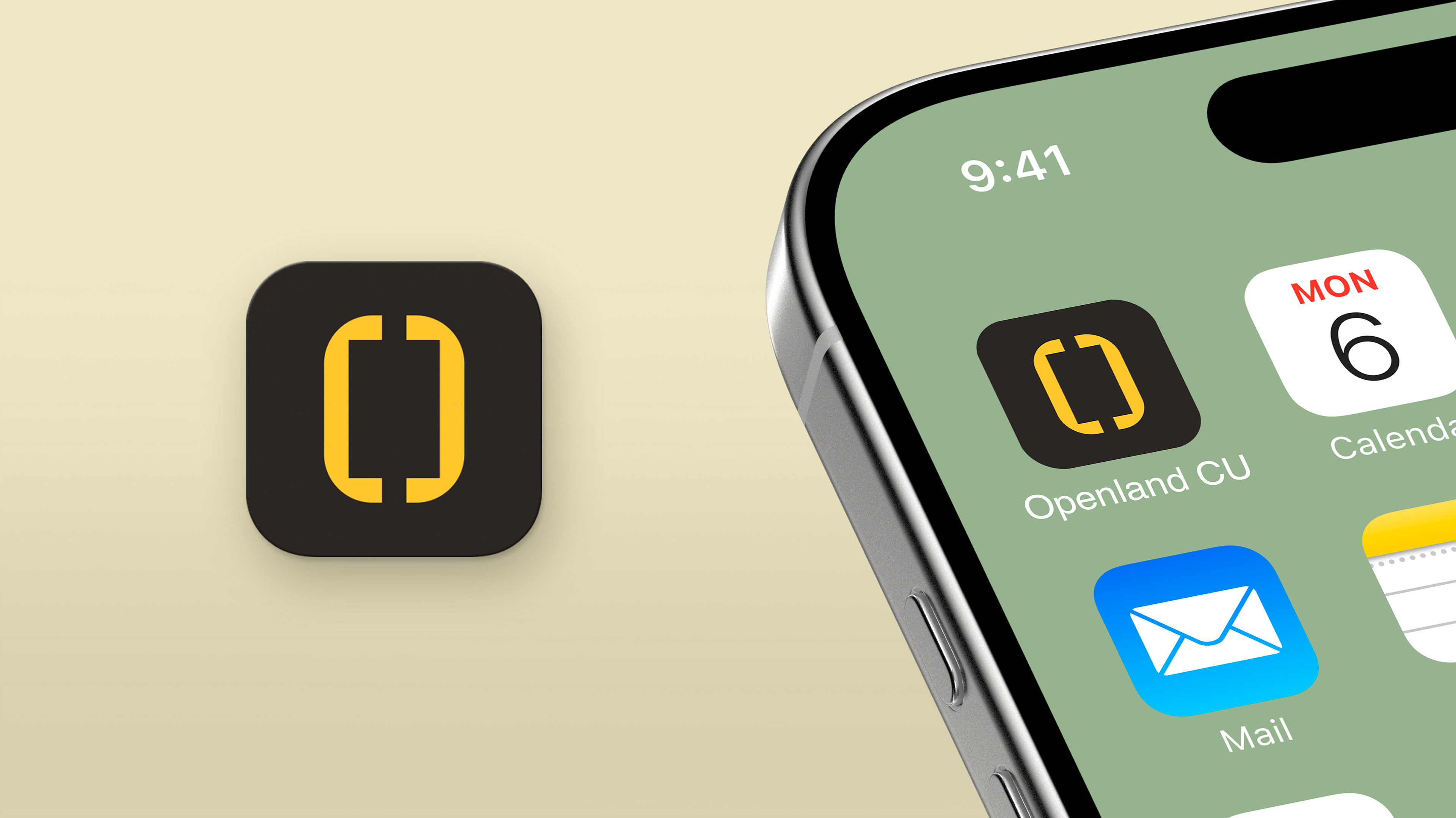
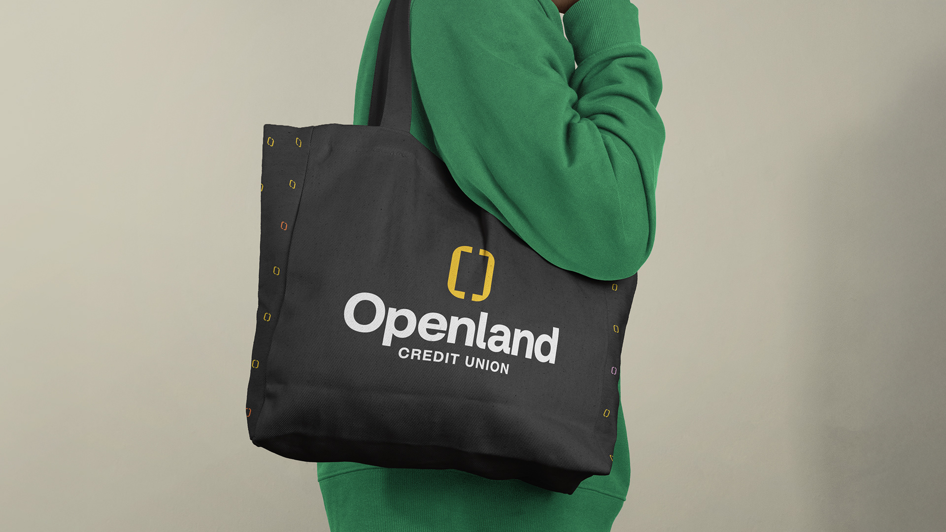
Our logomark is built from two simple shapes that come together to form an “O,” representing connection and unity. When separated, they act like brackets—framing ideas and drawing focus to what matters most. The form also suggests a doorway, symbolizing opportunity and what lies ahead.
Designed to be simple and flexible, the mark adapts across a wide range of applications, creating endless possibilities for how it can frame and highlight ideas.
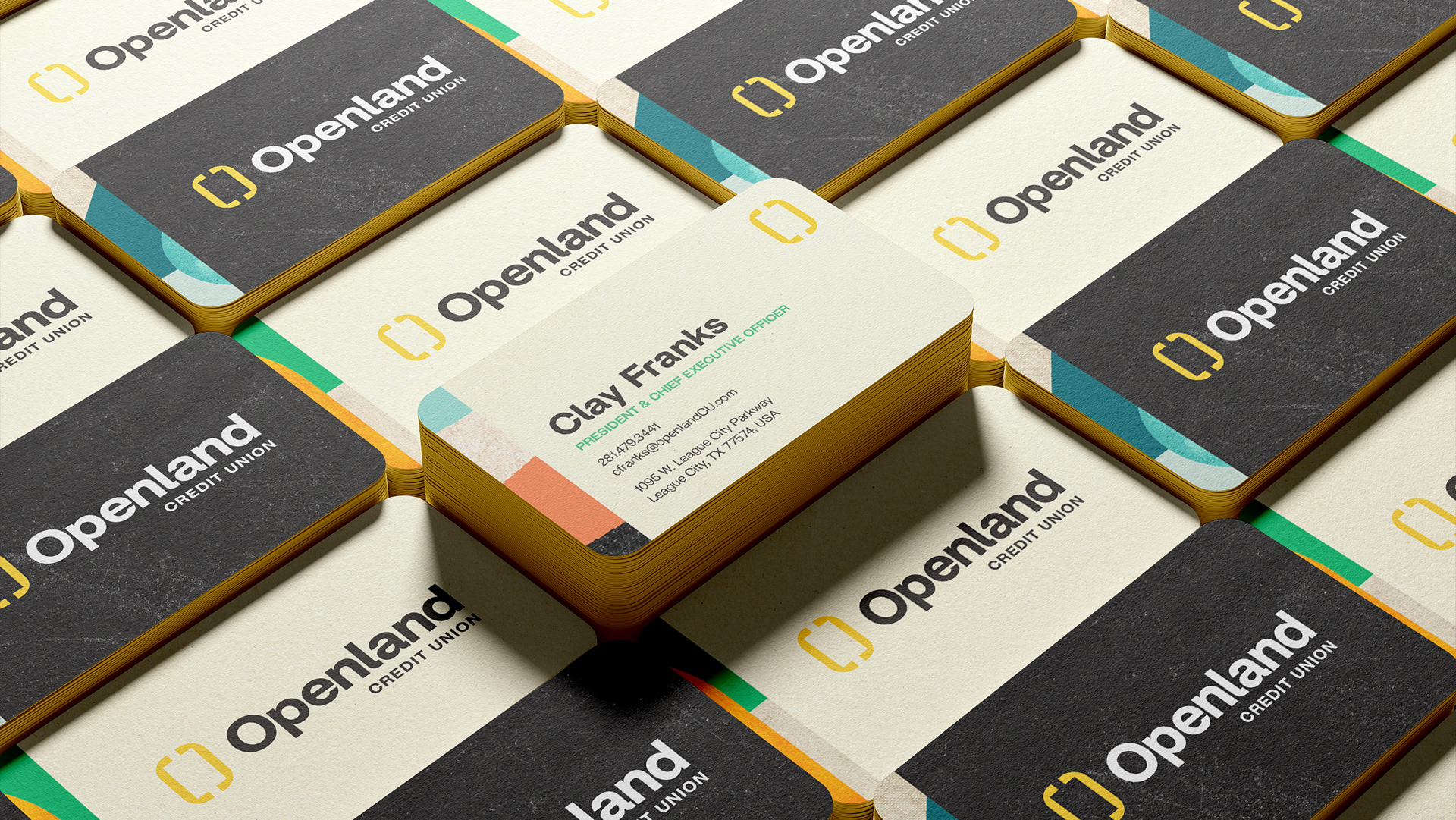
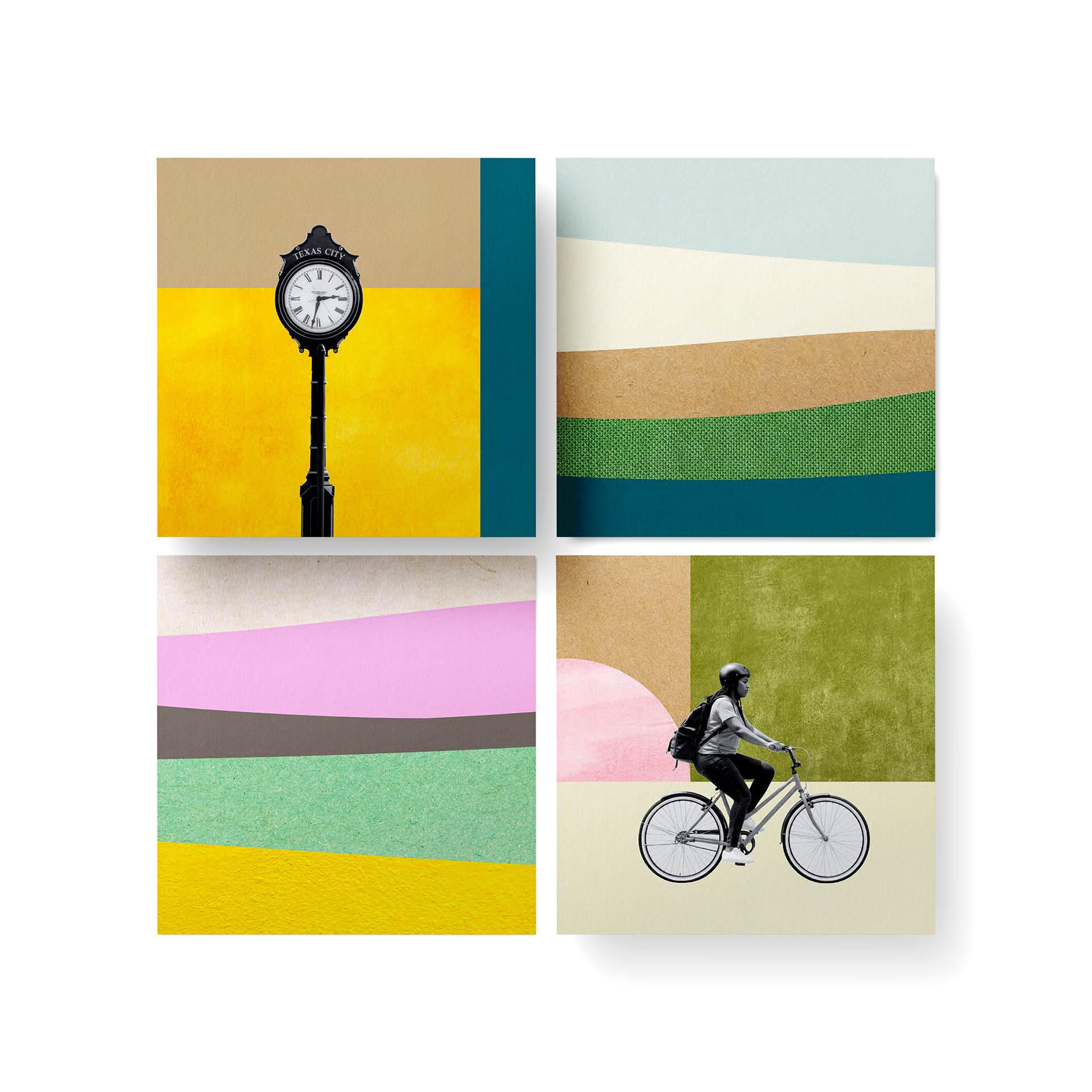
Brand Scapes
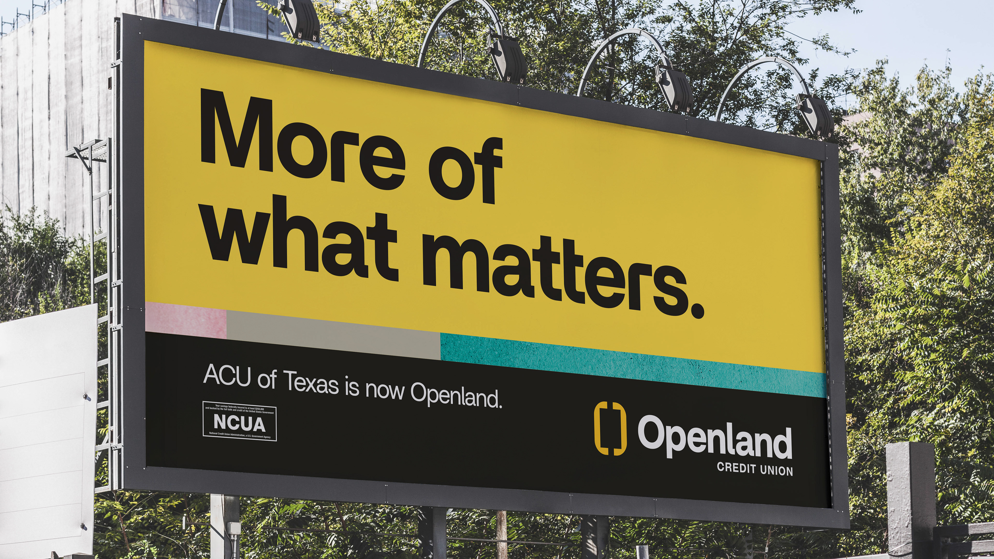
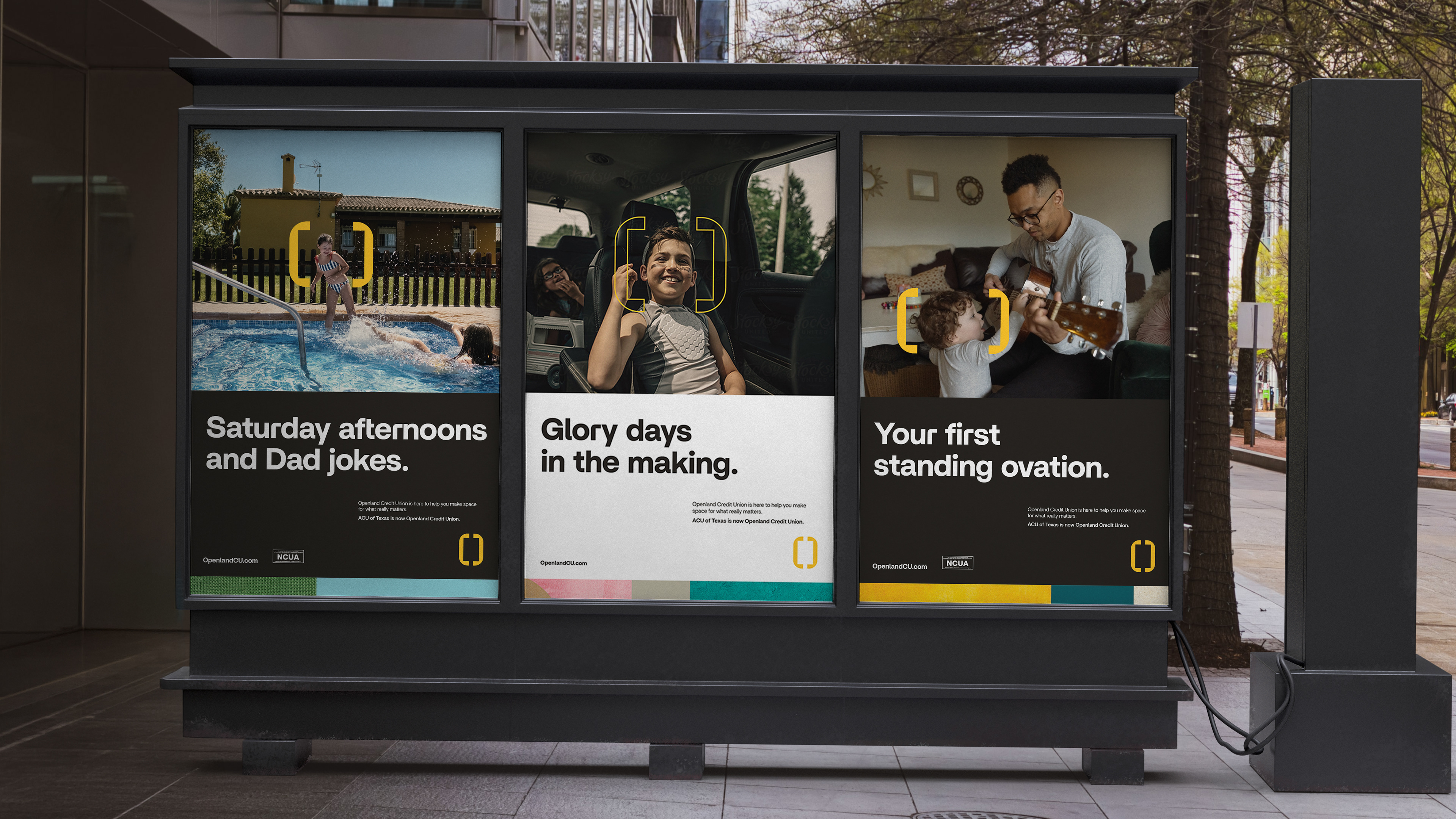
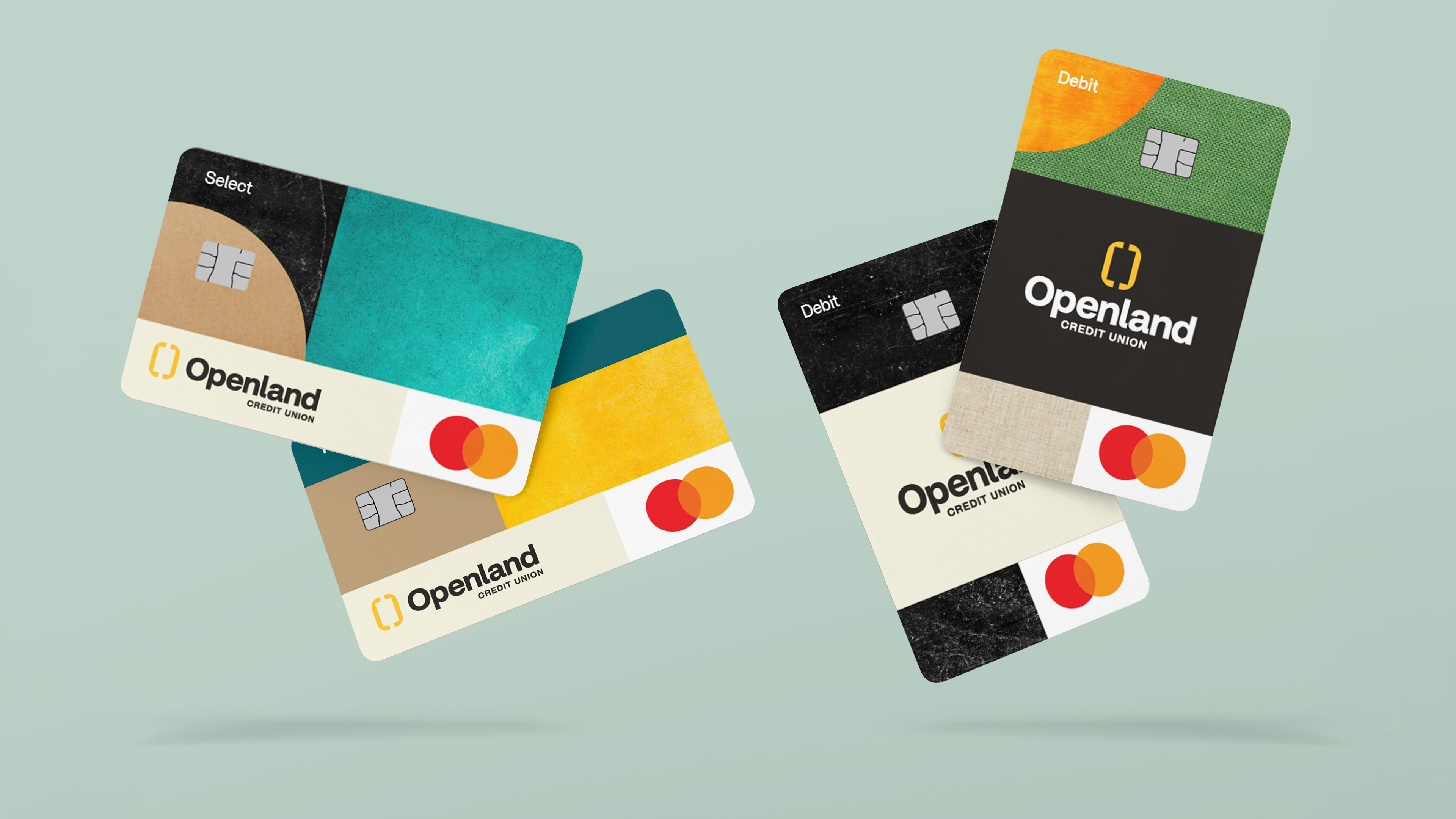
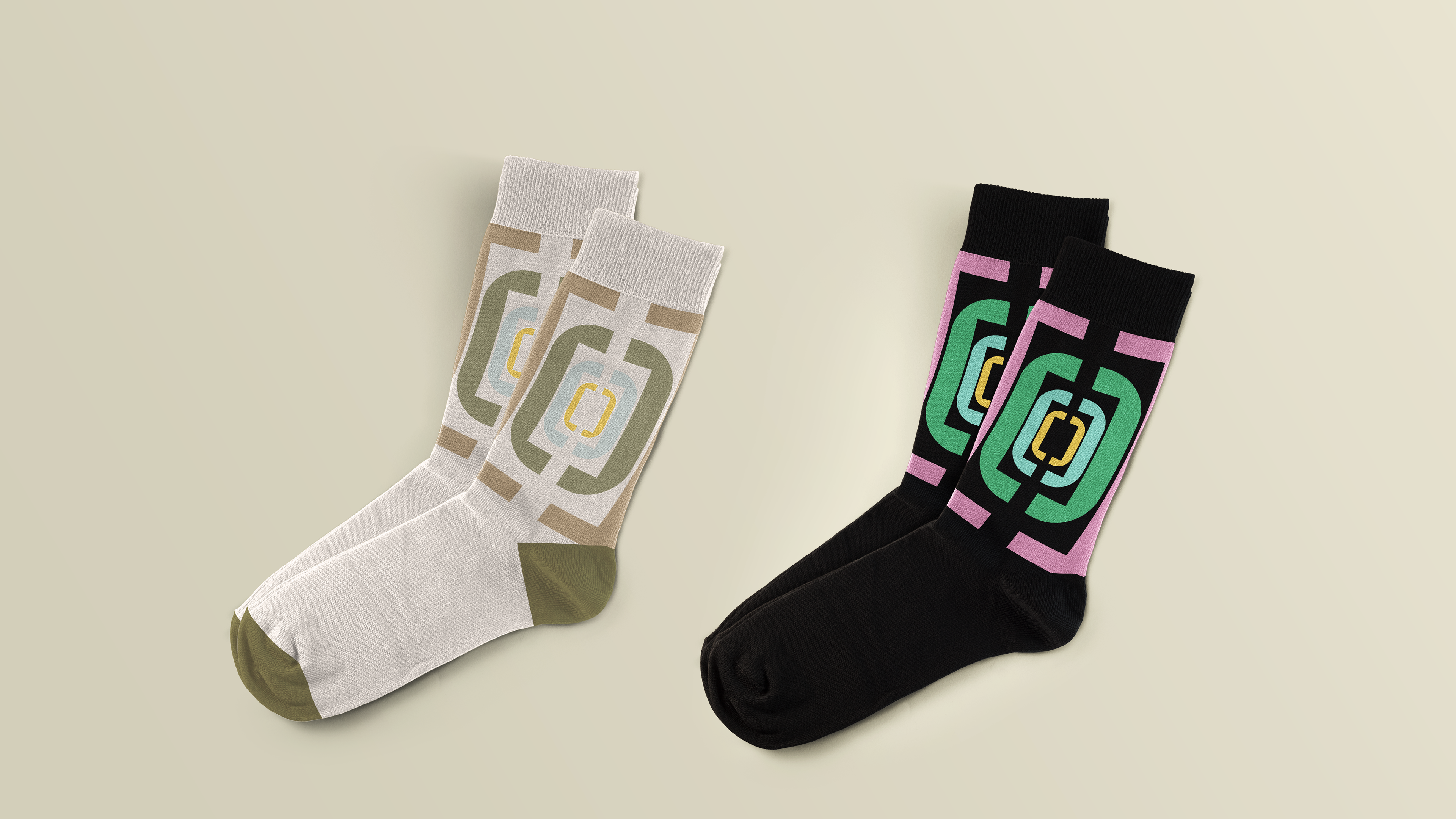
Brandscapes bring the clean, simple brand to life—pulling from the Houston landscape and layering in textures that add a more handcrafted, tactile feel.
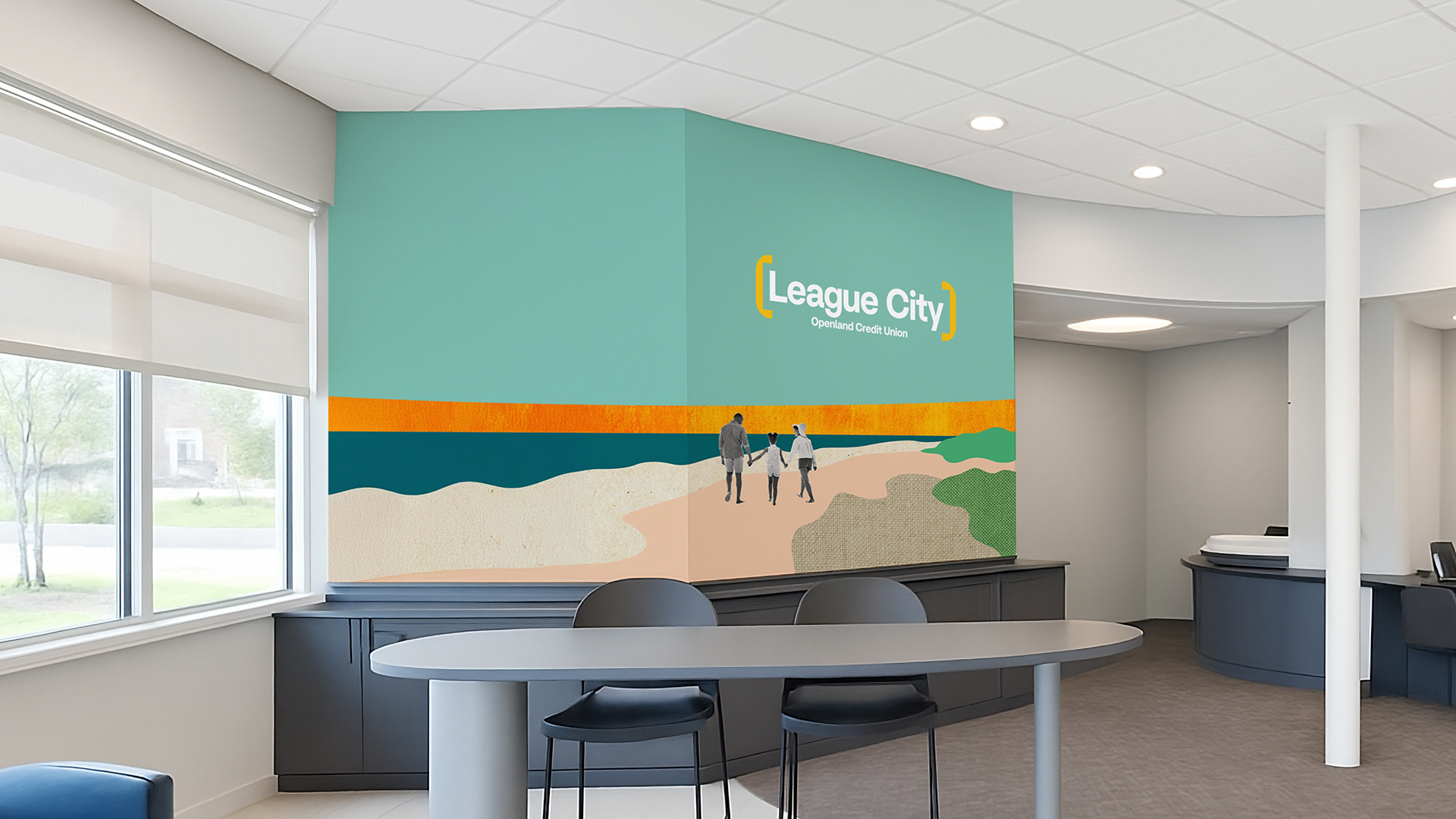
Space for more.
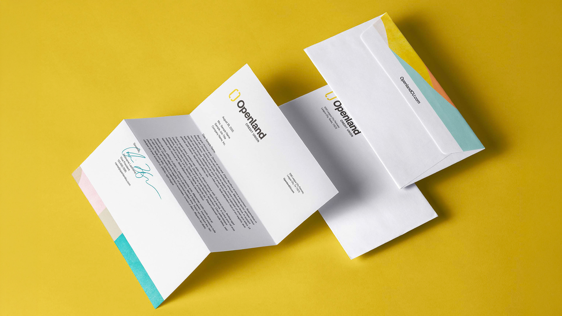
Lorem ipsum dolor sit amet, consectetur adipiscing elit, sed do eiusmod tempor incididunt ut labore et dolore magna aliqua. Ut enim ad minim veniam, quis nostrud exercitation ullamco laboris nisi ut aliquip ex ea commodo consequat.